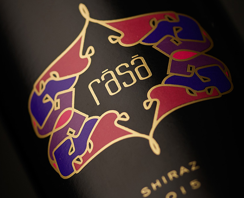
mosaic
brand identity, packaging
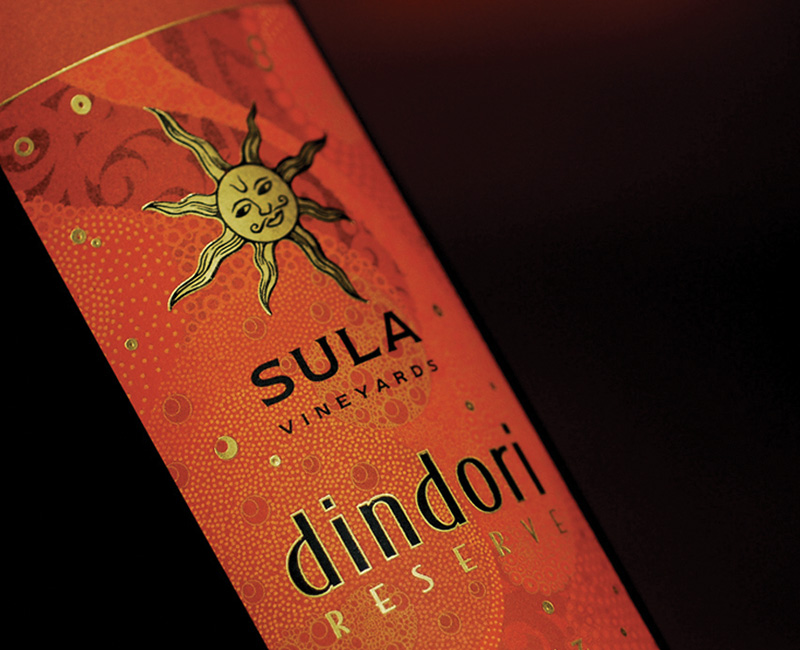
Packaging Identity for Sula Mosaic, uncomplicated, inviting and bold – an easy choice for first time wine drinkers.
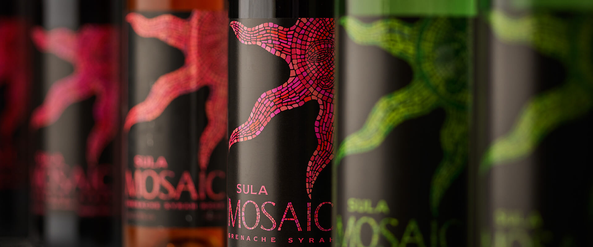
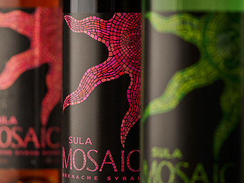
The new Sula range offered an array of flavours – a delicious fruity Rose, a Grenache Syrah and a crisp Sauvignon Blanc blended with a fruity Chenin Blanc.
The Identity and design for these labels was a natural evolution from the name. We drew inspiration from the rich, classical aesthetic of traditional Mosaics, and in keeping with tradition, our designers hand-drew and coloured each of element of the labels to reflect the detailed complexity of the craft.
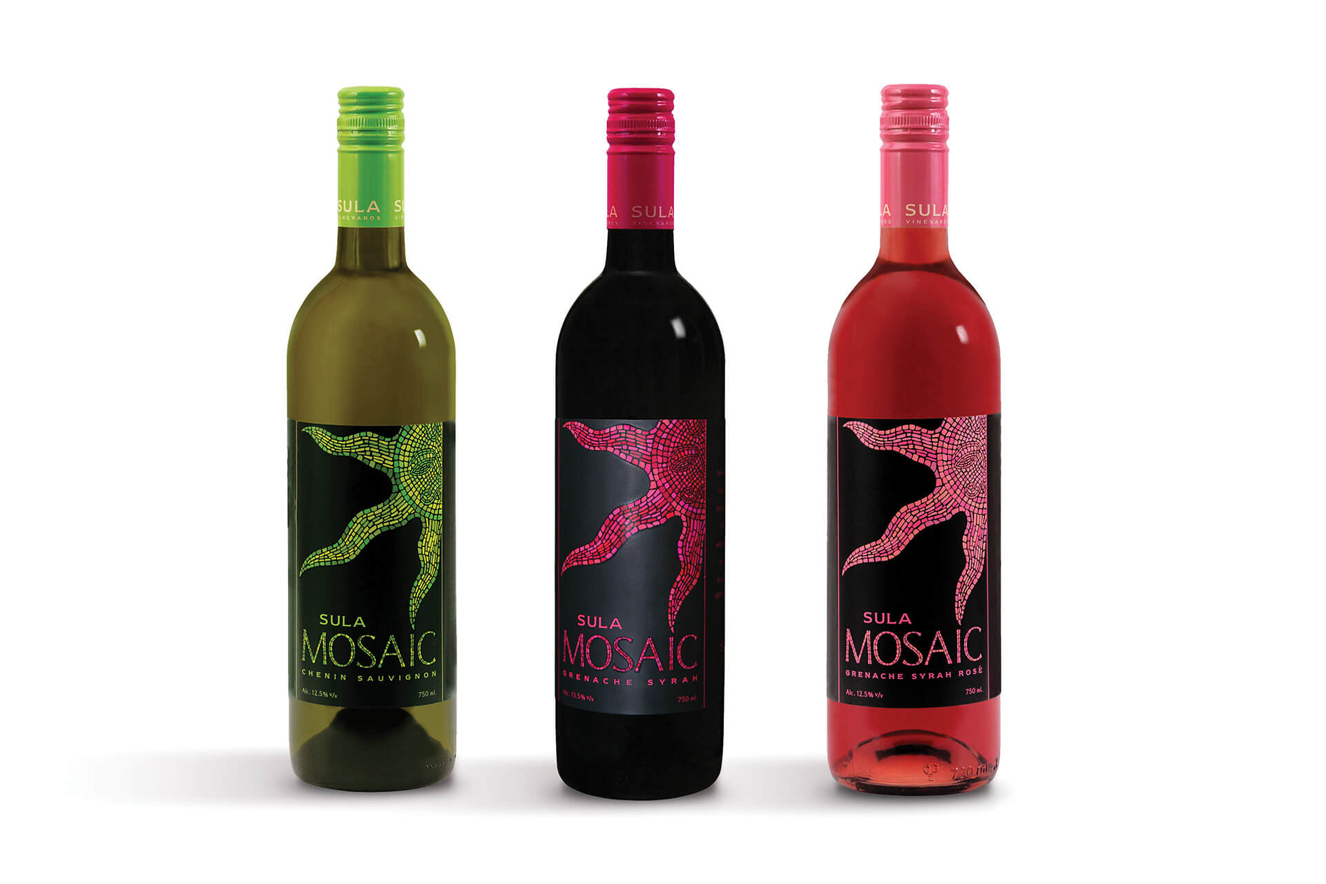
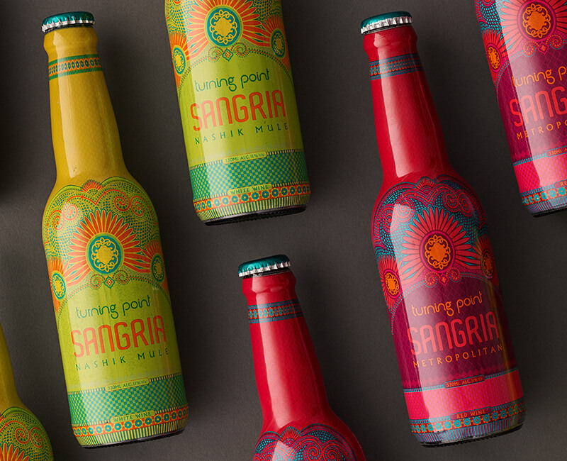
Targeted primarily at millennia’s, and budget conscious drinkers, this range of wine needed an Identity that would stretch across variants with little fuss, but with a pick me up quality.
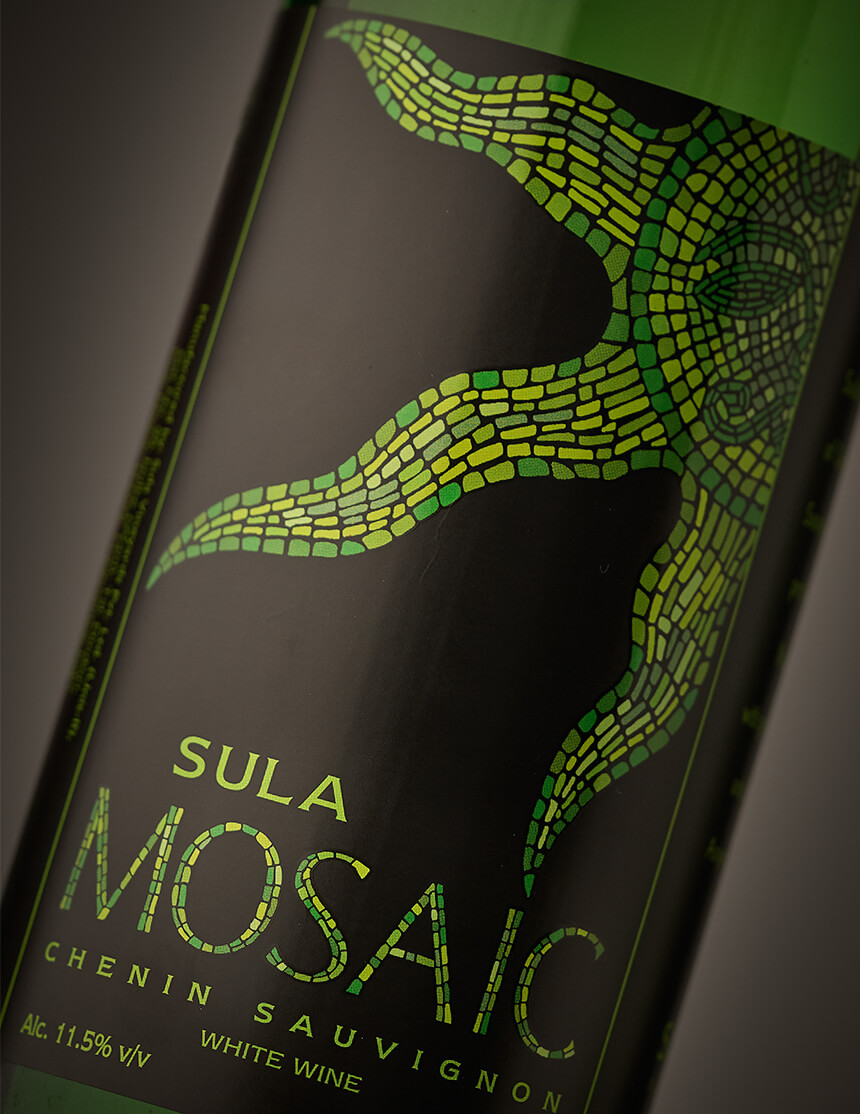
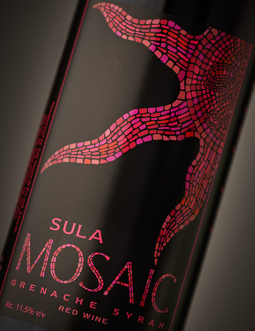
Drawing from the classical aesthetic of traditional Mosaics, we decided to go with hand painted chips in a range of shades within a colour. Integrating this graphic style into the typography helped in providing a simple unified whole.