turning point
sangria
brand strategy, brand identity, packaging
Genre-bending packaging for India’s first ready to drink Sangria; pop, layered and contextual. Created to tap the urban millennials love for style and Instagram.
Research indicated that there was a gap in the market – somewhere between the pre-mix and beer. rgd was asked to define the brand strategy that would be the key driver for effective positioning and packaging of the beverage. We realised that young women in particular were looking for a drink that was stronger than beer but milder than a hard spirit.
On digging deeper with the primary target audience we found the key insight to anchor our design. Young women drank in order to fit in, and be perceived as “lit and hip”. They sipped rather than glugged, and wanted a fashionable drink they could be seen holding at any social event.
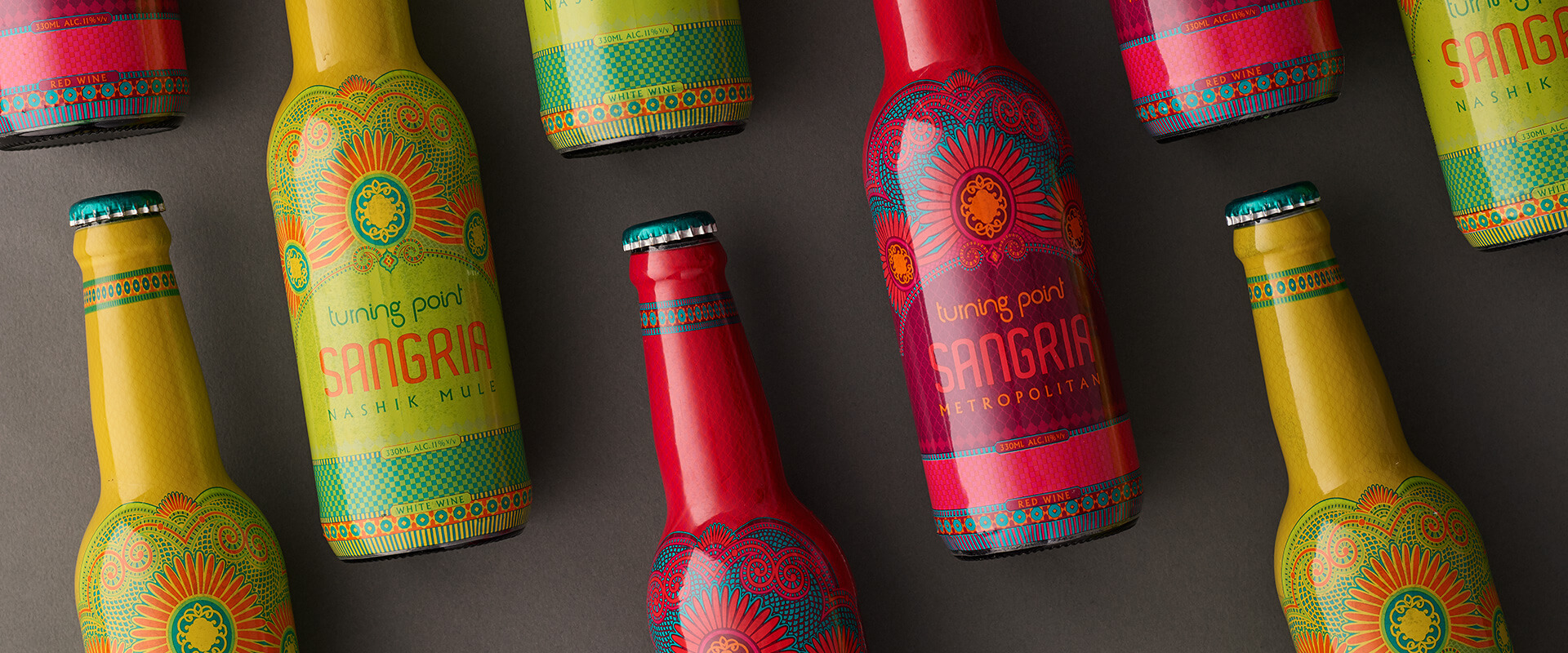
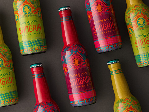
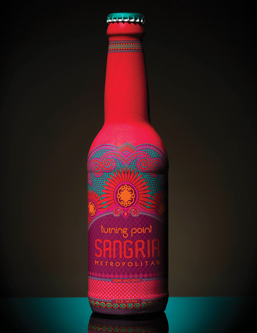
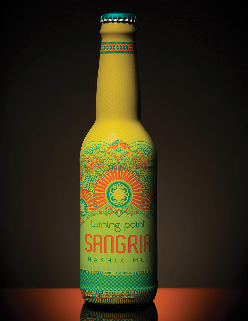
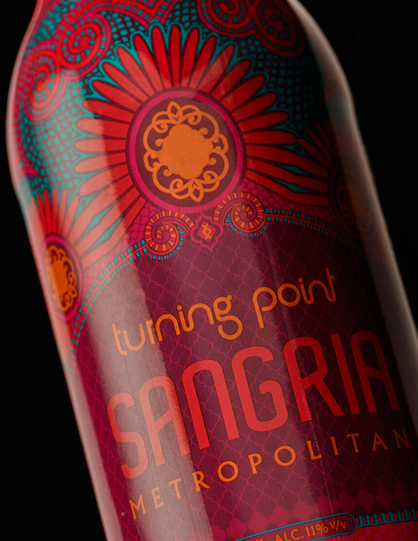
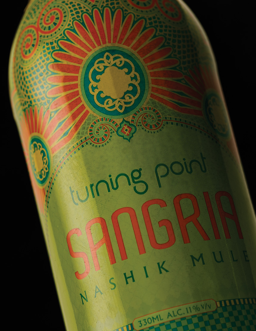
Having identified that Turning Point Sangria needed to be positioned as a fashion accessory, we used flip-top pint bottles, and fashion forward skins. The graphics were derived from embellishments like encrusted jewellery and Spanish mosaic. The overall design experience prompted consumers to drink directly from the bottles – anywhere, anytime. A choice they were happy to flaunt and post.
The packaging was a resounding success, winning awards and garnering unprecedented sales for the brand. Several thousand cases have sold through more than 1000 outlets in Maharashtra and Delhi NCR region.
We positioned Turning Point Sangria as a fashion accessory, to resonate with the needs of the young woman drinker. A “lit hip” bottle that she would be proud to hold and flaunt.
To create a standout visual experience, we drew from the traditional Spanish mosaic. An embellished but contemporary design that referenced product origin, without resorting to clichés. Fresh pop colours aligned with the flavours, talking India with a haute twist.
“rgd’s packaging designs for TP Sangria is a treat. The portability of the bottle, the rich and extremely potent graphic skin has taken wine cocktails, to a more youthful, relaxed space, contributing greatly to its success. Young people are flaunting it to their peers and re-using the bottles.”
– Ashwin Deo, Founder/CEO, Trinity Vintners