
dulwich international
schools foundation
brand identity
Giving the lineage of a 17th Century philanthropic British School a global outreach with the identity designed for its new charitable foundation.
Our design strategy recognised the need to carry forward elements of a heritage mark, whilst simultaneously propelling the foundation identity into a contemporary space; cuing diversity, hope and a growing footprint.
Whilst Dulwich International School Foundation(DISF) was a new entity, we found that the original school - Dulwich College, UK had a history of philanthropy, established in 1619 to educate lesser privileged boys.
This current remit however was broader than the founders’ original vision, and DISF would be working towards providing educational equity in the far corners of the globe.
Our design strategy was to create a mark that carried forward the lineage of Dulwich, and to establish the global reach of the Foundation. The mark needed to have presence and gravitas, cue diversity and instill a sense of hope.
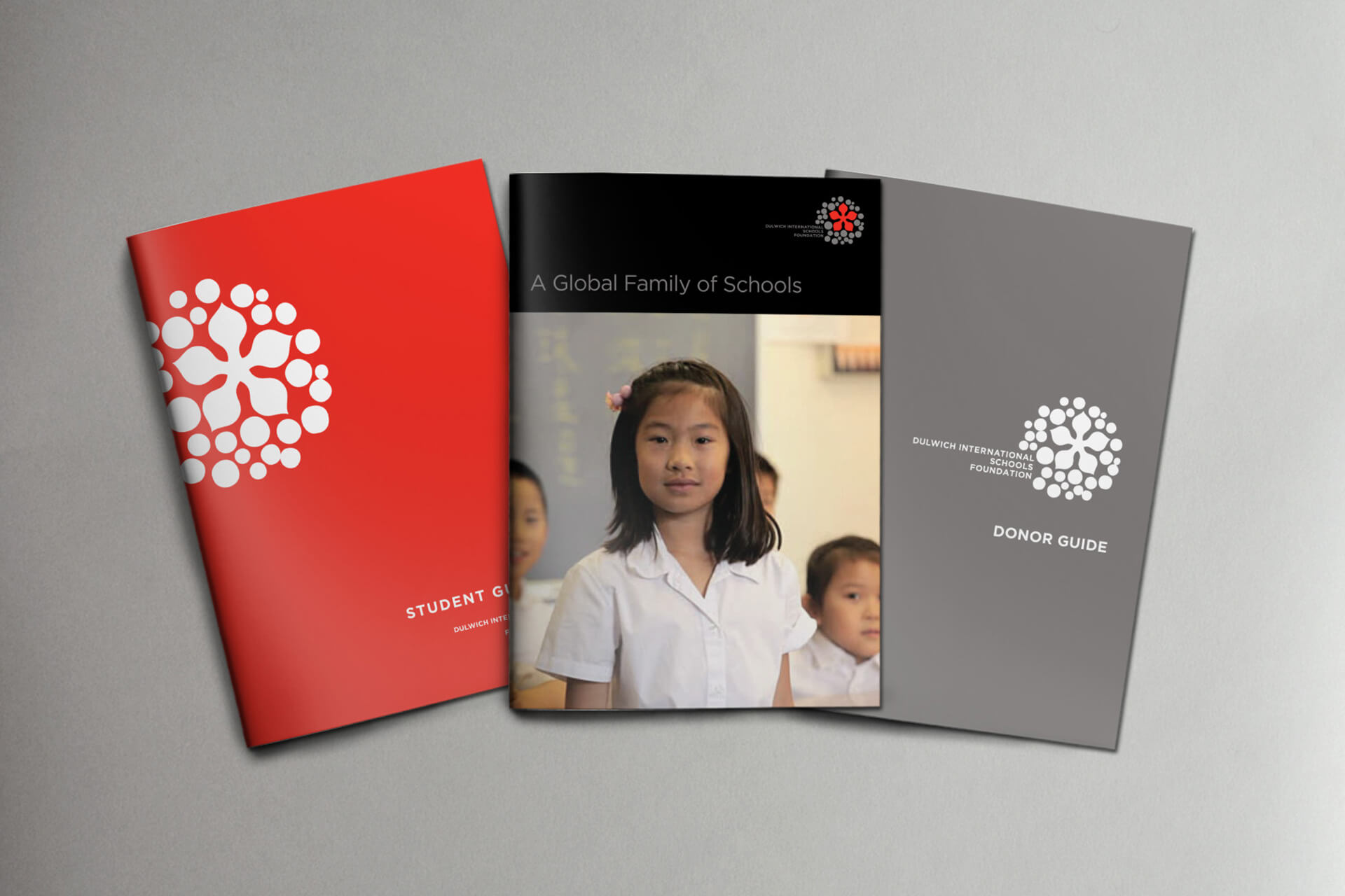
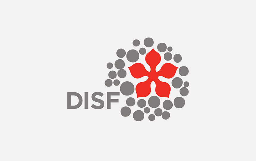
The design expression juxtaposed a redrawn version of the original Dulwich cinquefoil in bright, life affirming red, over hand drawn circular clusters symbolising diverse communities, in warm grey. The mark worked to fulfill our strategy, and in addition communicated the largeness of thought and the granularity of action, necessary qualities for a foundation like this.
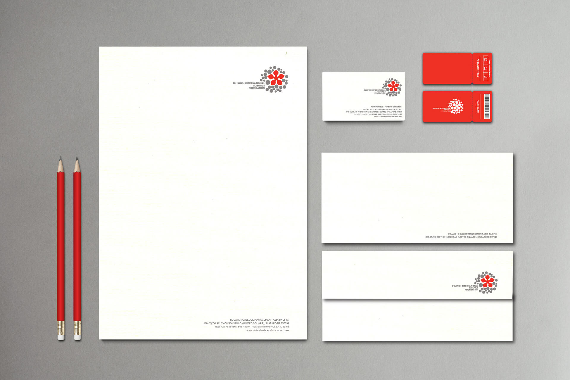
The design expression uses a redrawn version of the original Dulwich cinquefoil in a bright, life affirming red. This five pointed flower seemingly spreads out across the globe, embracing diverse communities in its wake.
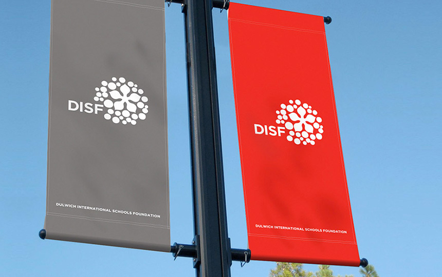
The sharply configured colour palette, allows the brandmark and identity to work across cultures and work spaces, be it school grounds, funders or governments.