firstsource
brand identity, communication, editorial
A name change, an identity makeover, corporate imaging and communication; building a brand and a decade long partnership.
In 2006, one of India's top 10 business process management company, ICICI OneSource, was planning a public listing and needed a brand transformation starting with its name and logo and over the course of the year its identity. The challenge at the time was, that almost the entire equity of the company resided in the name and colours of its then promoter, ICICI, India's largest private sector bank. rgd was tasked with the Identity change
Our main challenge was to overcome employee resistance to the new name and design a brand mark and identity that respected the deep sentiment invested by the company's over 6000 employees in the previous logo.
Our design process started with semiotic surveys, face-to-face and group discussions across several layers and functions to understand the emotional salience of the existing mark, and the values and aspirations that employees wanted preserved and reflected in the new Identity.
The new name Firstsource, was closely aligned to the company’s mission. Its single minded goal was to be the first source of excellence for customers and employees across the globe.
Skillfully combining the old beloveds with new dreams, rgd designed a brand mark, that communicated the organisations belief in partnerships and linked excellence.
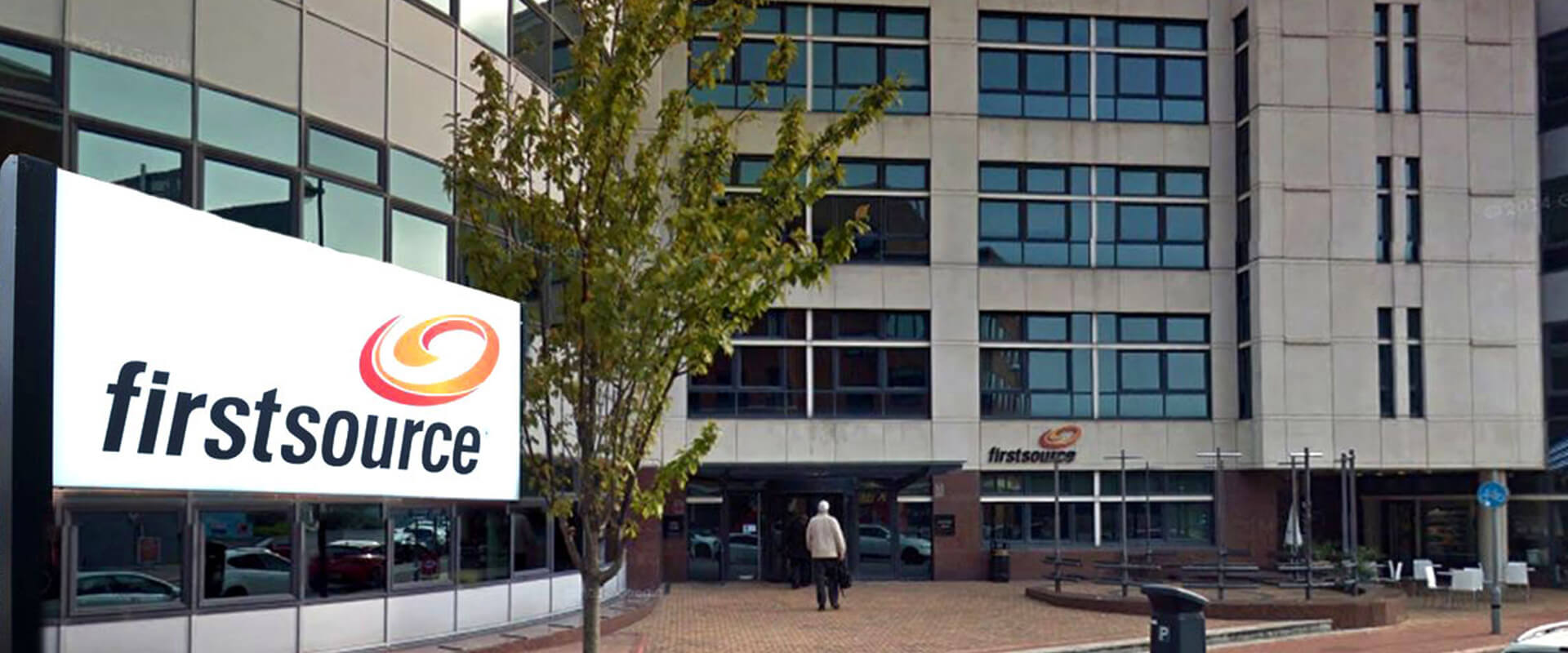
The mnemonic, a dynamic upward trajectory of intertwined colours, that circles around a notional world, referenced the original ellipse in the ICICI logo, was warmly embraced and which today has endured for over a decade.
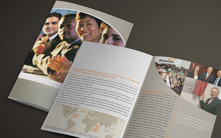
Following a successful listing, rgd was an essential partner in helping create a feeling of ownership of the new identity and continued to build the brand across every aspect of the company's communications. From annual reports, investor communications, newsletters, communication posters, facilities branding, and corporate stationery.
rgd's strong, bold and clean graphic approach helped the Firstsource identity become a matter of pride and more than hold its own against the Company's strong international client brands.
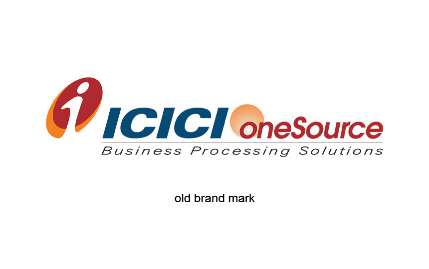
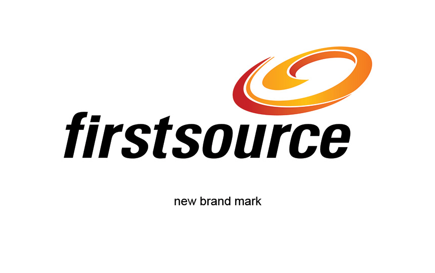
Semiotic surveys and discussions were undertaken to understand the emotional salience of the existing mark. The values and aspirations that employees wanted preserved were carefully reflected in the new mark. Sensitively combining the old beloveds with new dreams.
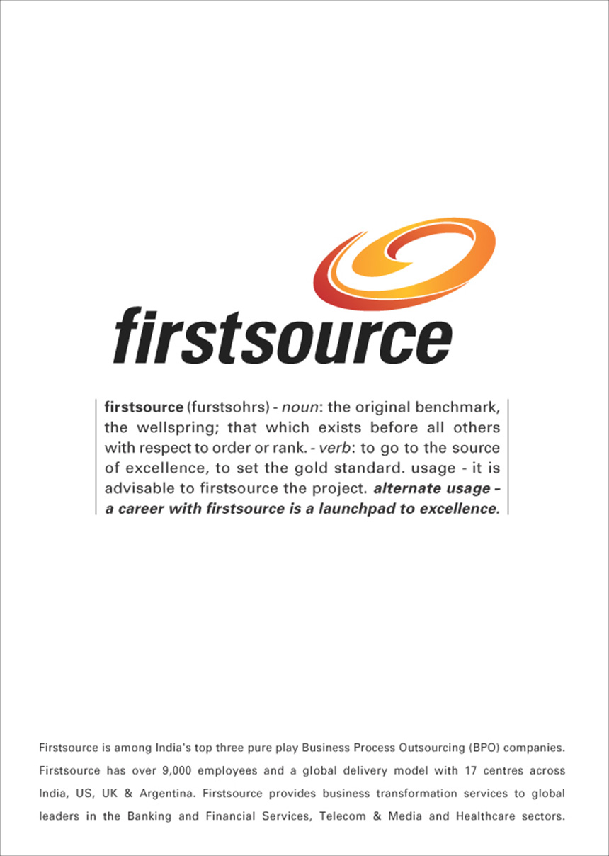
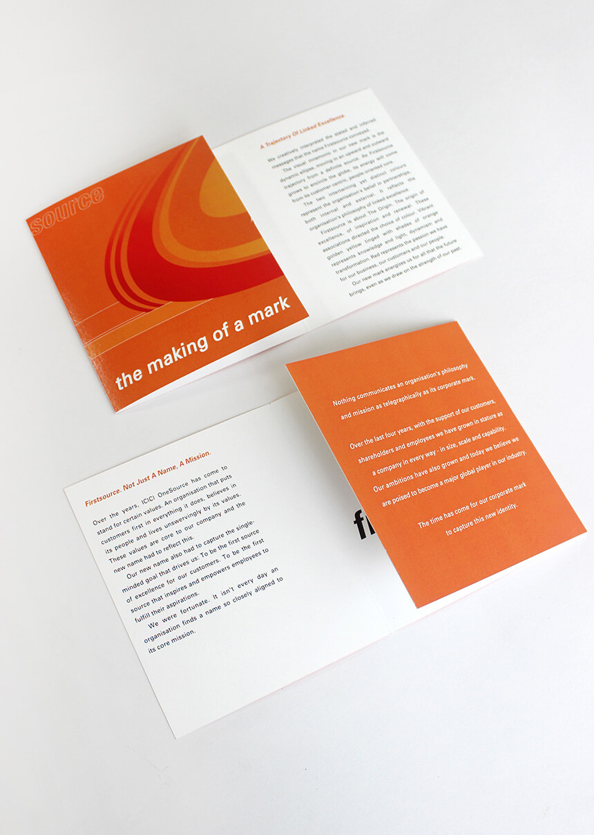
A dynamic upward trajectory of intertwined colours that circles a notional world, referenced the original ellipse in the ICICI logo; the brand mark telegraphically communicated the organisations philosophy of linked excellence, and its intent to capture markets across the globe.
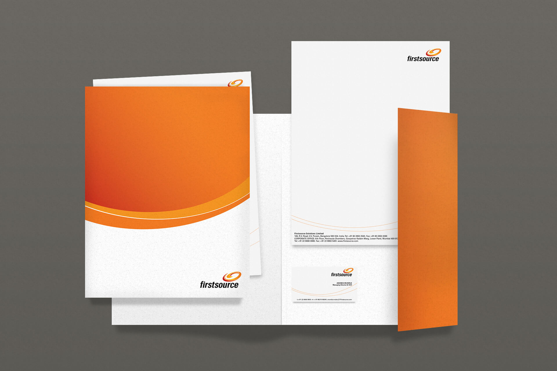
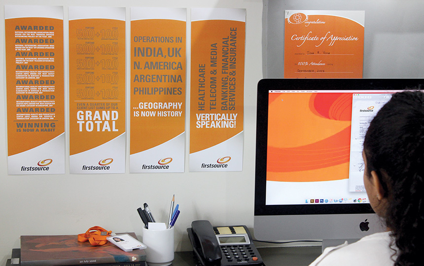
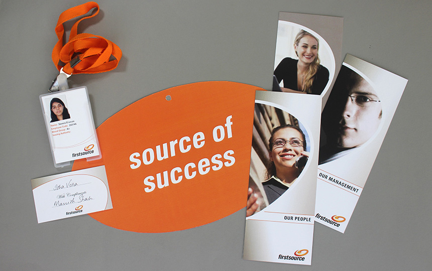
The new name Firstsource, was closely aligned to the company’s mission. Its single minded goal was to be the first source of excellence for customers and employees across the globe. We worked worked to translate this mission across communication – both external and internal.
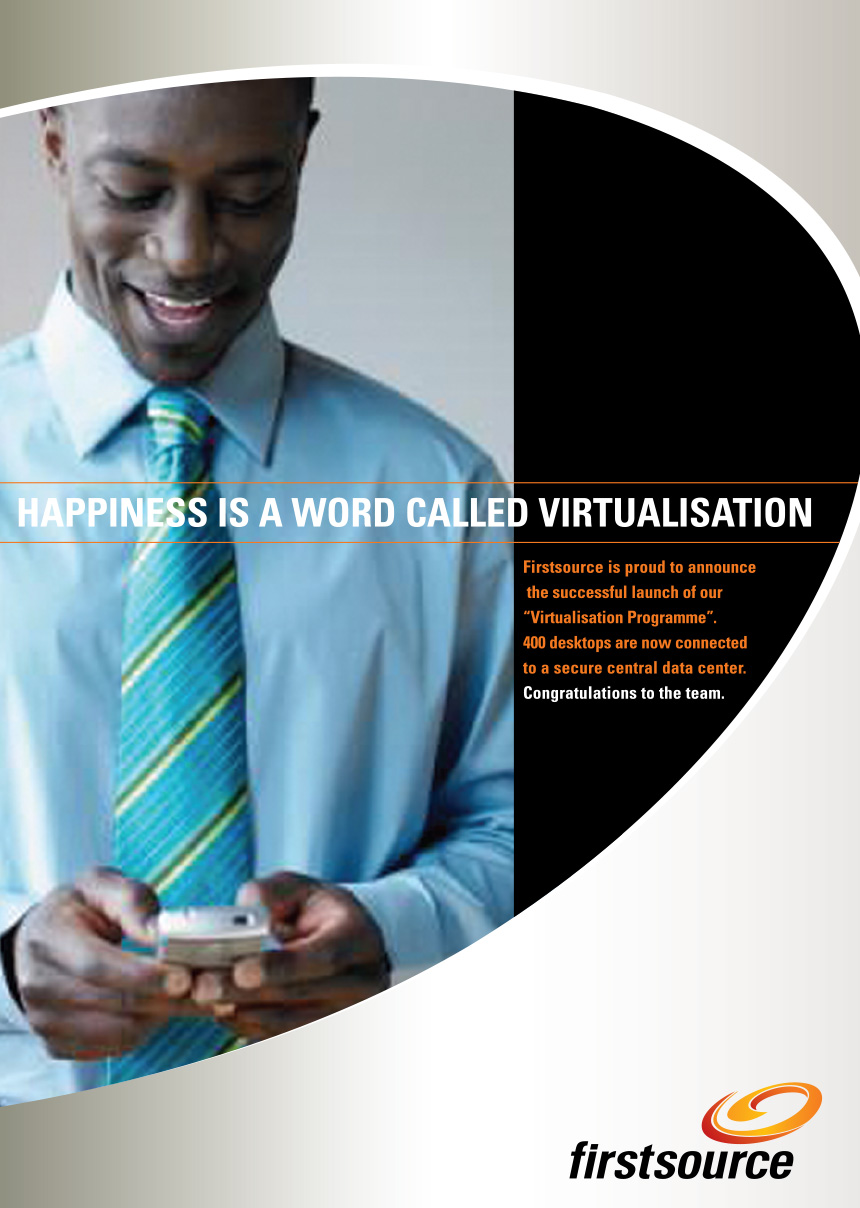

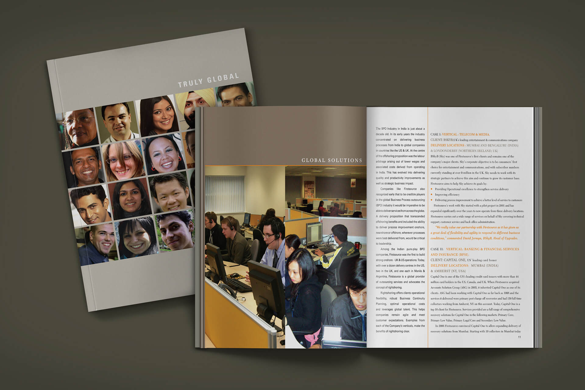
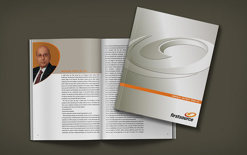
We partnered with Firstource for almost a decade; helping to create a feeling of ownership of the new identity and then continued to build the brand across every aspect of the company’s communications across geographies.
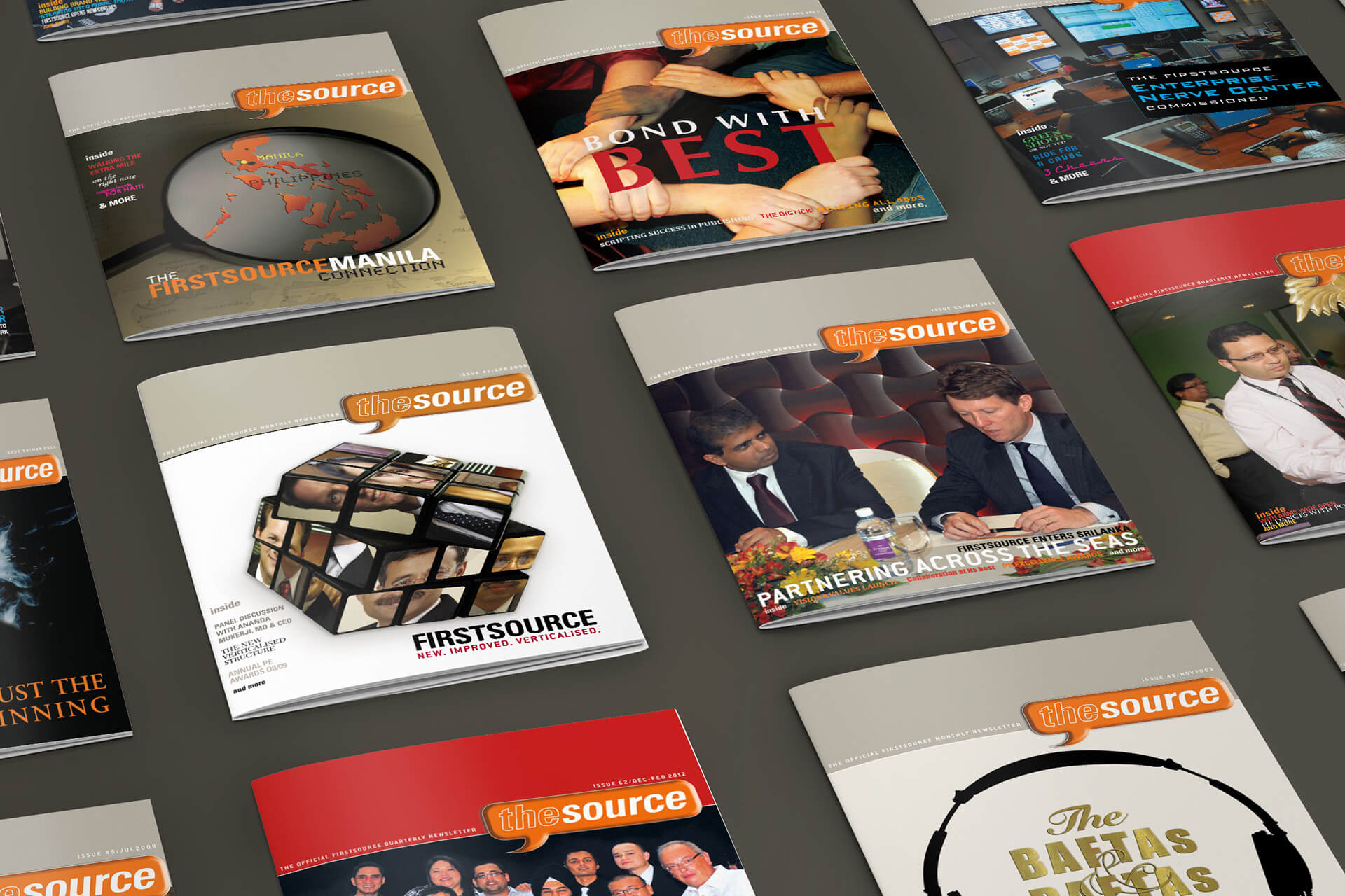
Our editorial strengths, in-house capability to develop content helped in publishing and producing the company’s award winning newsletter on a bi-monthly basis.
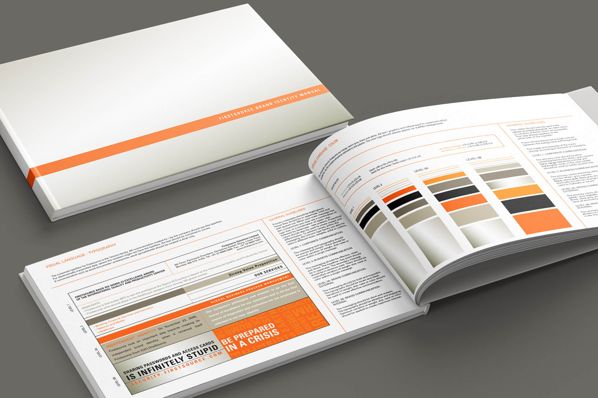
Our ability to strategise, design and deliver seamlessly across the organisations’ many operations across multiple geographies helped in building a robust system. The Firstsource identity become a matter of pride and more than held its own against the Company’s strong roster of International brands.
