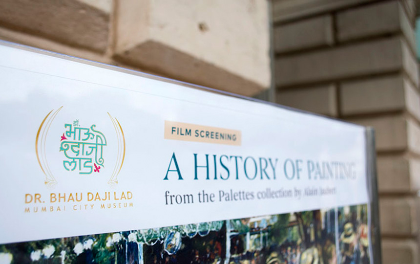
dr. bhau daji
lad museum
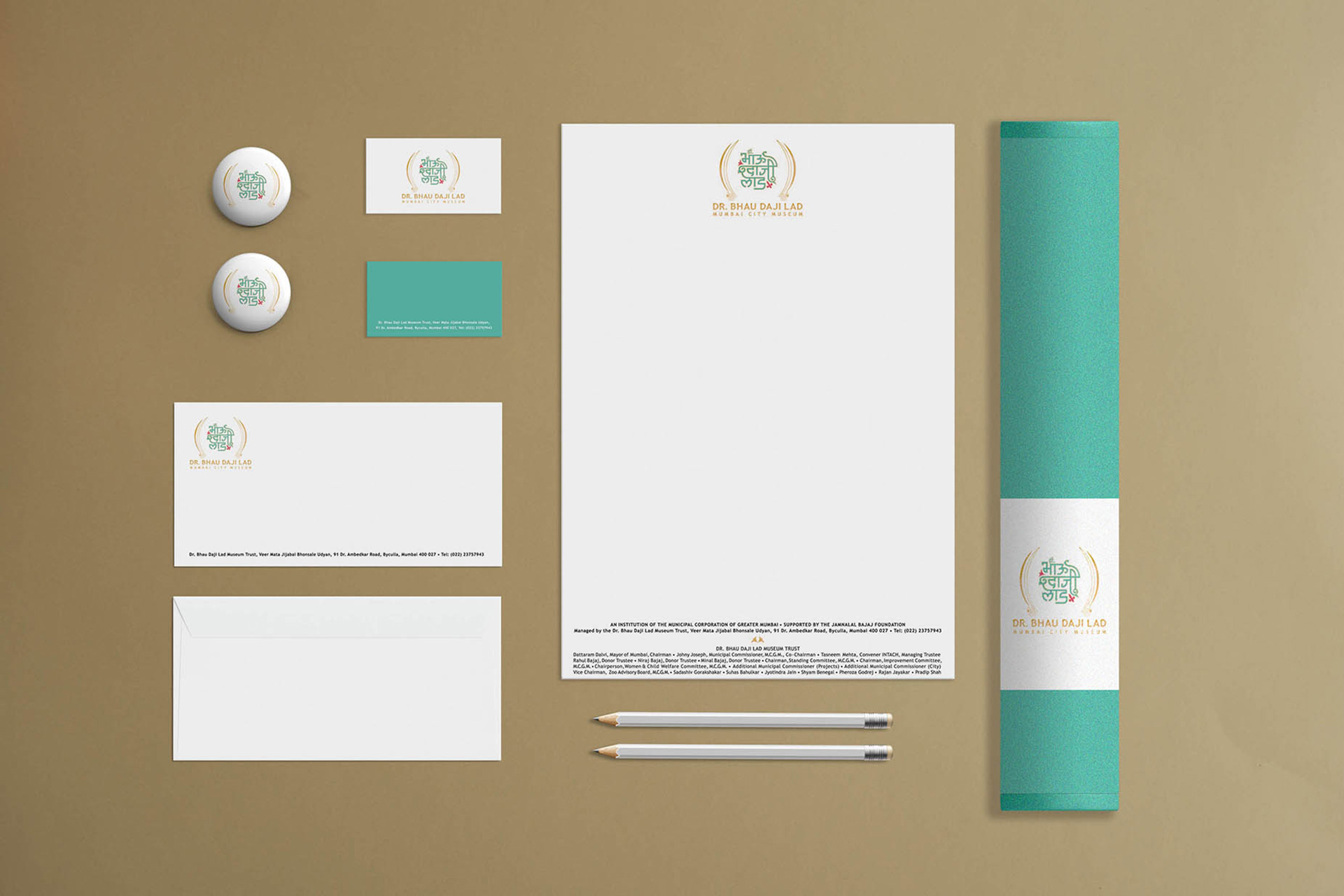
brand identity
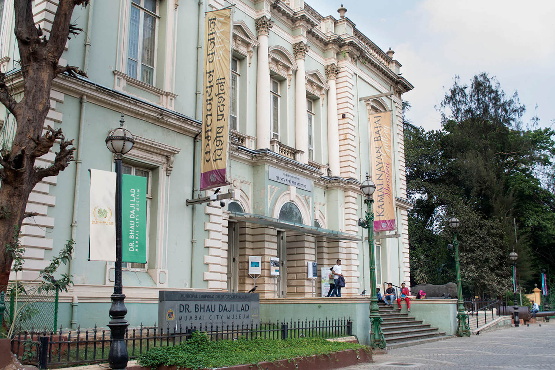
This design project entailed recontextualising the image of a museum borne in the Bombay Presidency era. The Brand mark needed to connect the museums historic past to the Mumbai of today; whilst emphasising the concept and the environment.
When the museum closed doors for renovation in 2003, it had already been renamed Dr Bhau Daji Lad Museum, in honour of the man whose vision and dedication enabled its establishment.
The museum’s renewed mission was to promote a better appreciation of Mumbai’s cultural and economic past as represented in the permanent collection, and to encourage cross-cultural understanding through contemporary programming – local and global.
In 2008, the need to redraw the Museums mark to better represent its place in contemporary Mumbai was clearly apparent and we were brought on board. Our approach was two-fold. The brand mark needed to reflect both the space and its cross-cultural programming. But most importantly it needed to belong to the city and its people.
We took an unusual approach. We felt concept articulation had to be both bi-lingual and cross-cultural, acknowledging the museum’s past and present. The logotype was hand-drawn in devnagiri and combined with the Roman script. By using the universally understood “parentheses” we positioned the museum as a repository within the city, a “set off space” that provides us curated glimpses into the world outside our daily lives.
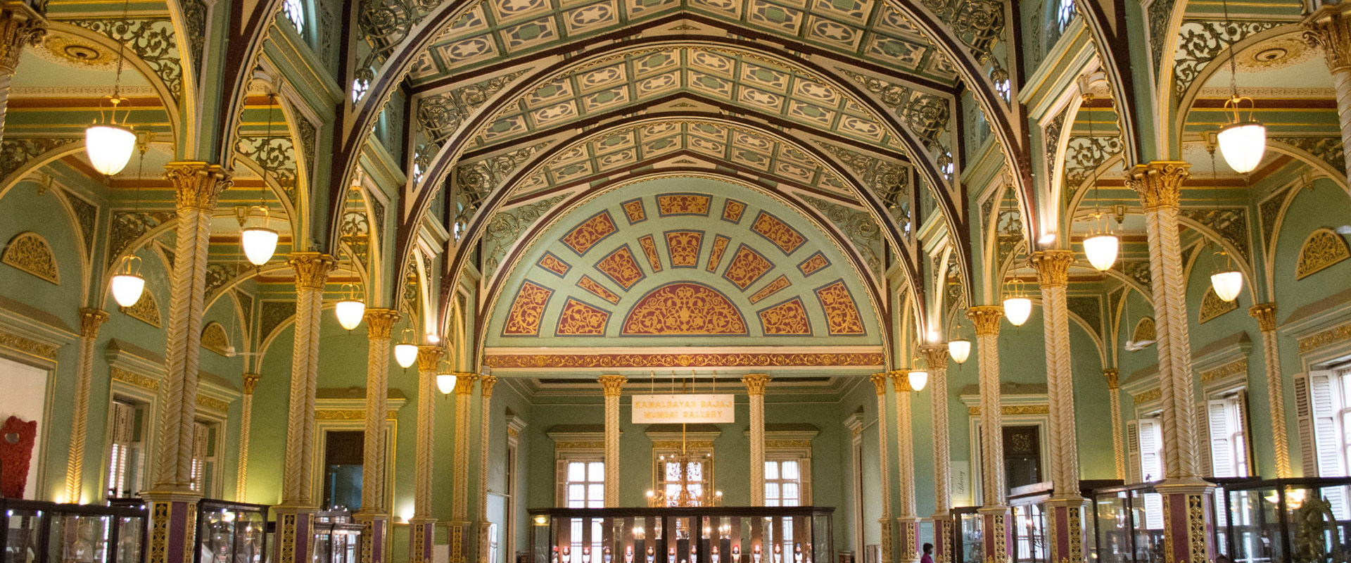
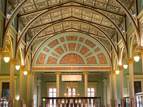
The design aesthetic drew from the High Victorian interiors of the Museum building - to create a mark that is contextual and memorable.
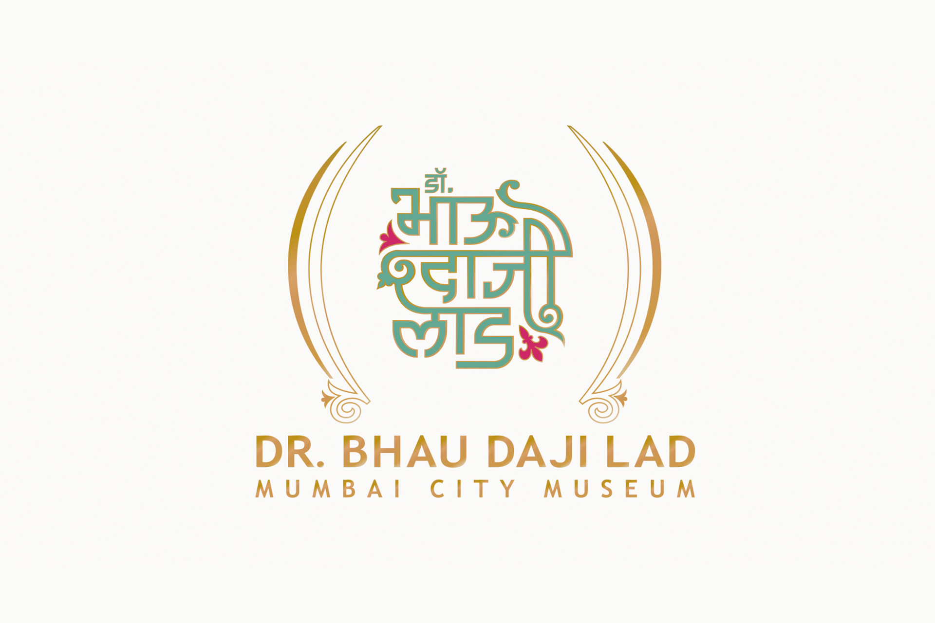
rgd created a rare example of a bi-lingual brand mark that references the original concept of the museum – a repository of industry and culture, and extends the idea to framing of new experiences, a nod to the curation, the programming and diverse set of stakeholders.
The cross cultural visual language and colours borrow from the typology of the museum interiors, marrying a baroque style to devnagiri.