the true school
of music
brand strategy, brand identity,
communication, digital
Creating currency for a music school; A design solution that bridges the divide between the formality of a school and the unbridled passion of musicians. Our strategy was to ‘switch on’ both students and parents, musicians and technicians across age groups, suitably aligning the many faces of the tsm experience across its varied stakeholders.
Our first task was to develop a brand position and an Identity that established TSM as more than just a school. The Identity and Visual Language needed to resonate with youth; appeal to parents; align faculty and industry partners; and connect with the music industry. And position TSM as a professional body committed to furthering music education.
We developed a brand positioning that addressed diverse audiences, establishing TSM’s multi-faceted contemporary approach. We focused on the school’s personality and dynamic, progressive attitude, with the emphasis on TSM’s promise to young entrants – a chance to succeed; get ‘Switched on’; and tune in to the demands of the music industry.
Our design strategy took off with a key brand insight – shorten the school’s/brand name, and align it with today’s world of instant messaging. This move positioned the school very firmly as a millennial brand, and helped rationalize the design delivery.
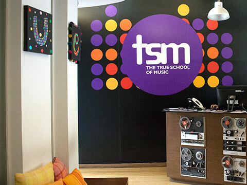
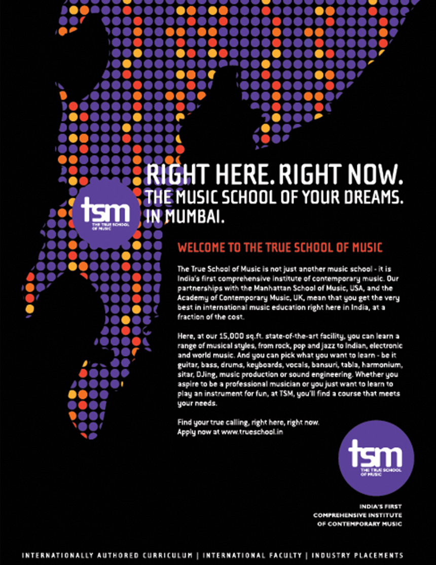
The Brand Mark and Visual Language needed to be dynamic and modular in nature. Allowing the brand to speak in different tones across its varied stakeholders. Cueing the stability and solidity of an educational institute when required or being vibrant and in your face when desired.
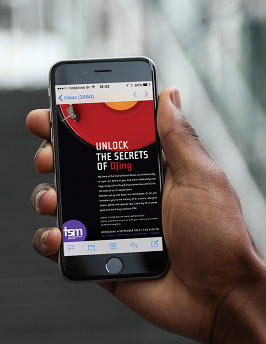
A simple Brand Mark supported by a dramatic language created a very strong visual salience, encompassing the real and the digital.
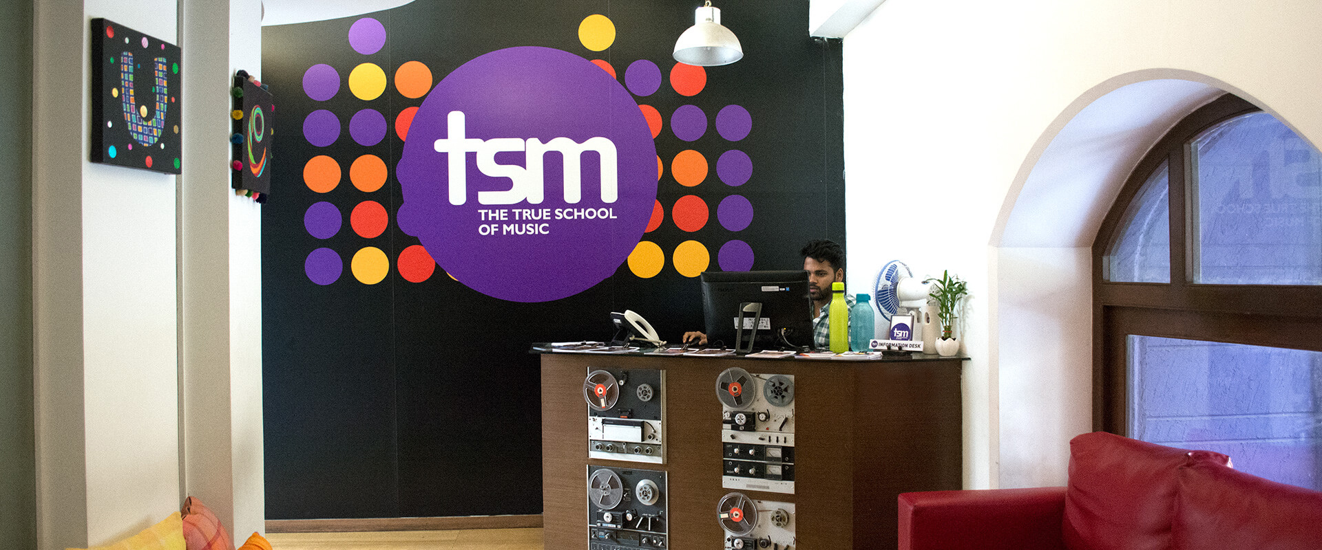
The circle - the chosen brand form was the mainstay of the brand architecture for TSM; creating synergy between the different offerings of the school, changing colours to signify different programmes. Dynamic patterns within the visual language, borrowed from an equalizer display, reflect the high energy of the brand; the diversity of students and community; and cue amplification and growth.
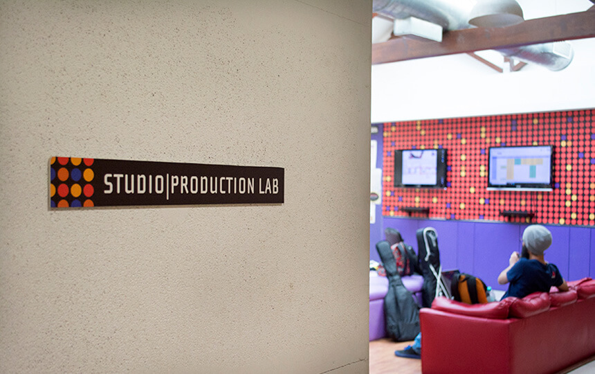
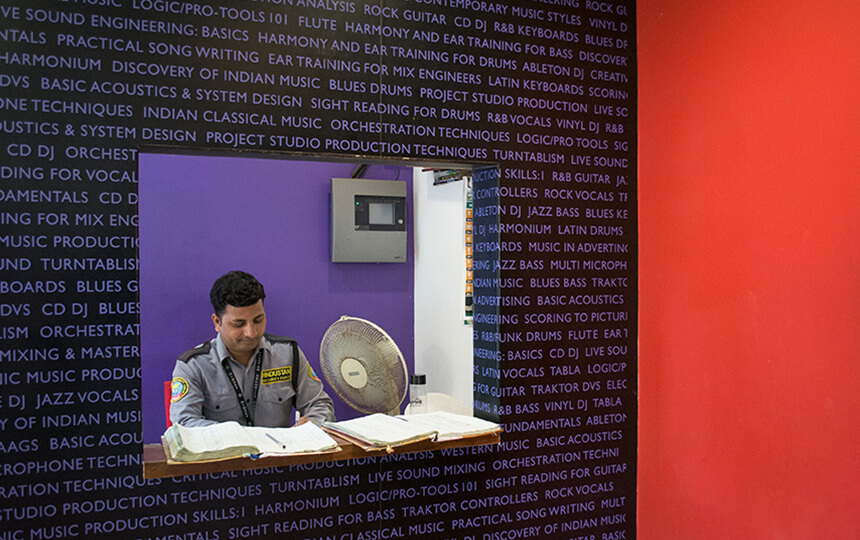
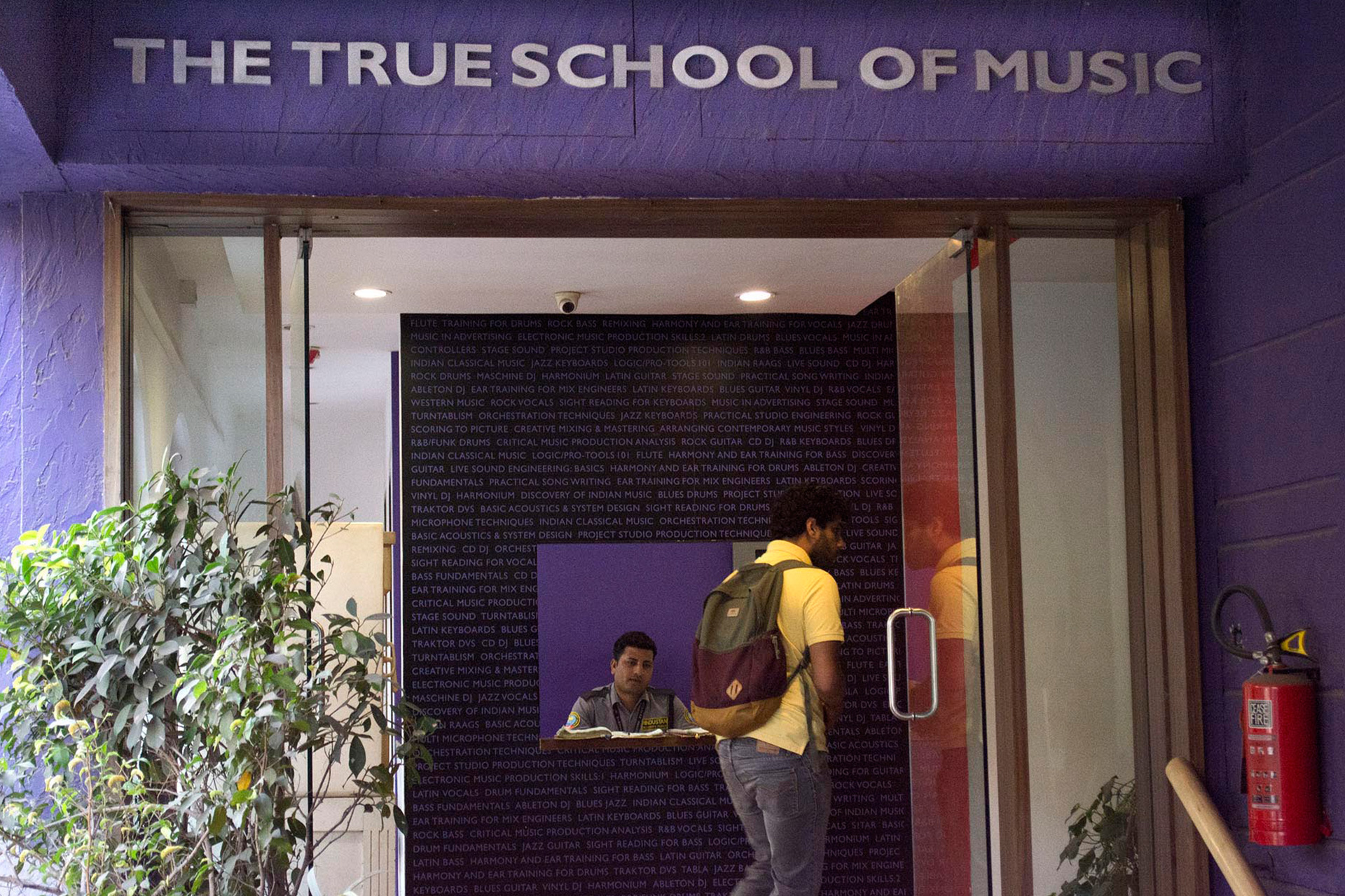
The modular nature of the design allowed us to use the language with ease across different touch points - signage, branding, communication and merchandise.
TSM is a runaway success, and within five years, has crossed the 1500 student milestone, attracting guest faculty and tie-ups from Europe, America and Japan.
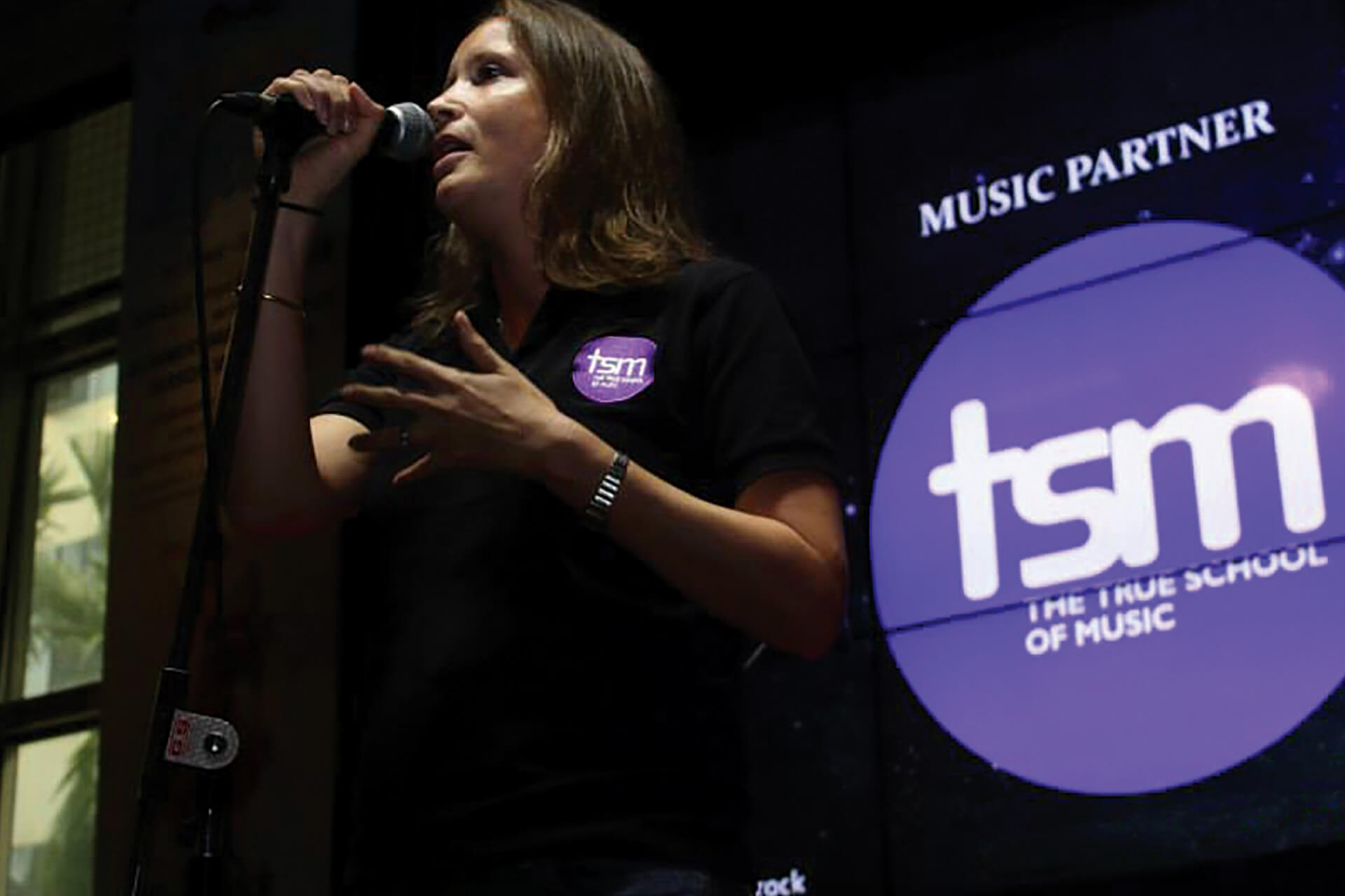
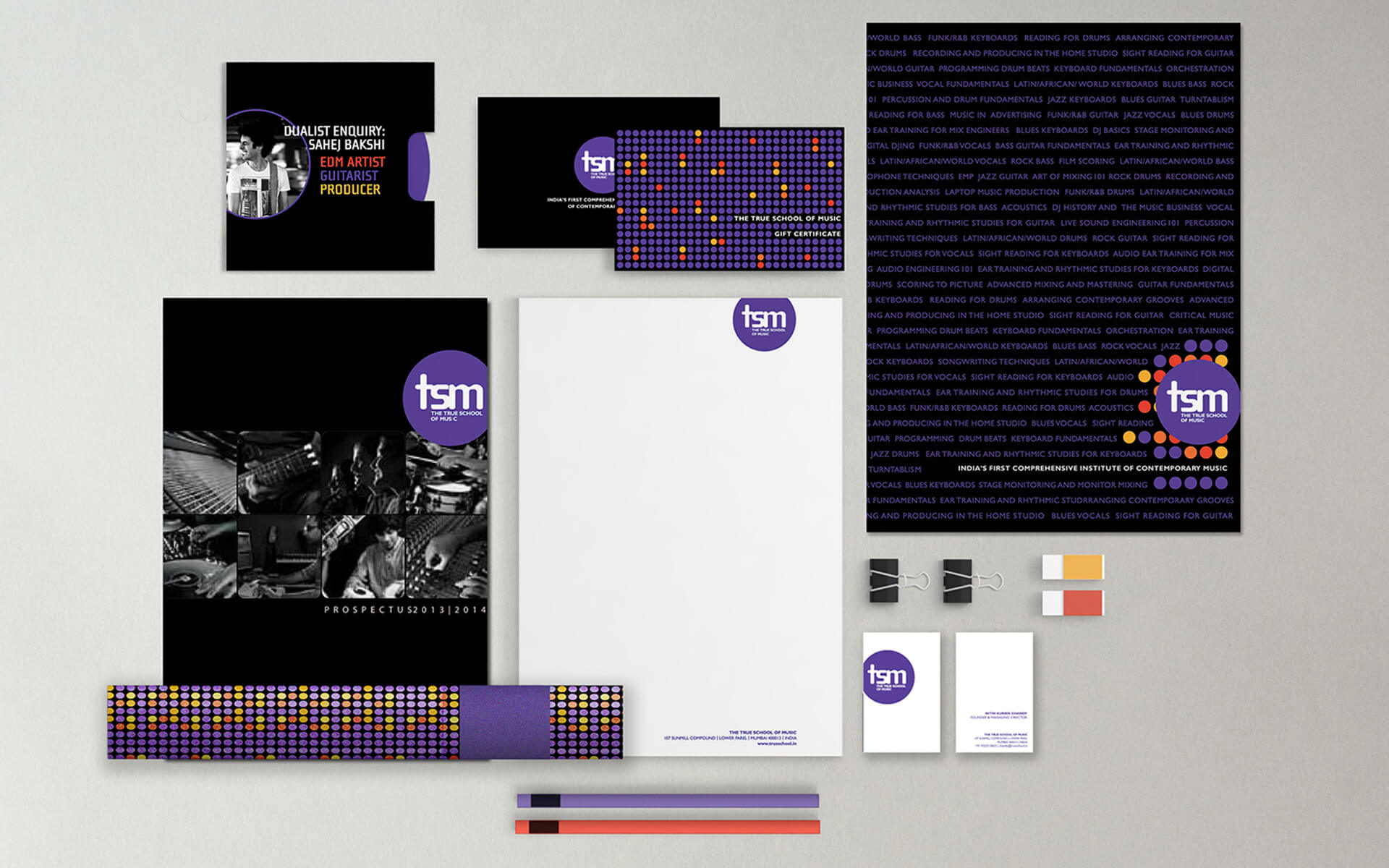
A key brand insight – to shorten the school’s name, and align it with today’s world of instant messaging, positioned the school very firmly as a millennial brand, and helped rationalise the design delivery.
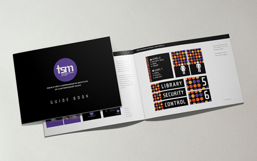
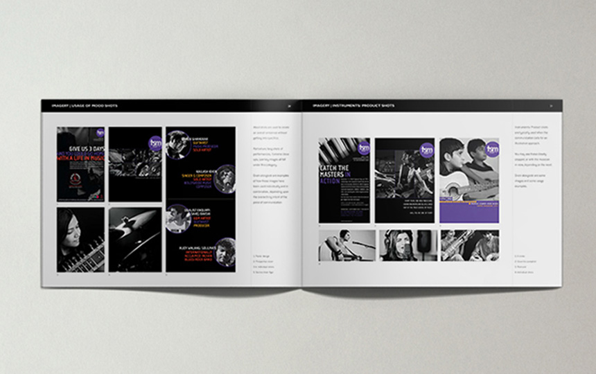
The colours chosen for the brand architecture worked both with music and colour theory – the three different levels of enrollment were colour coded according to the learning levels, and came together much like an equaliser display.
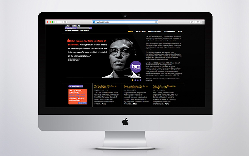
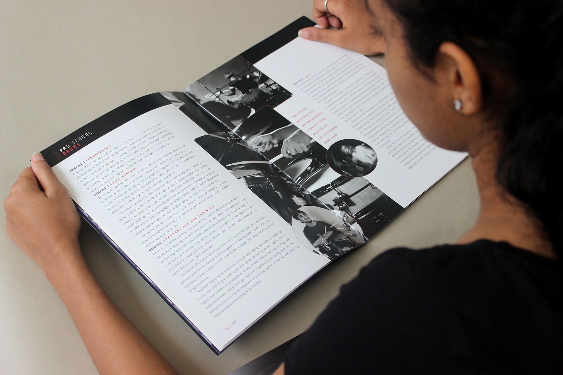
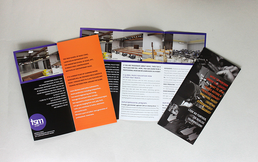
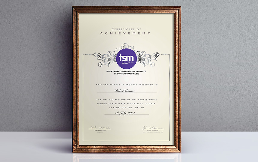
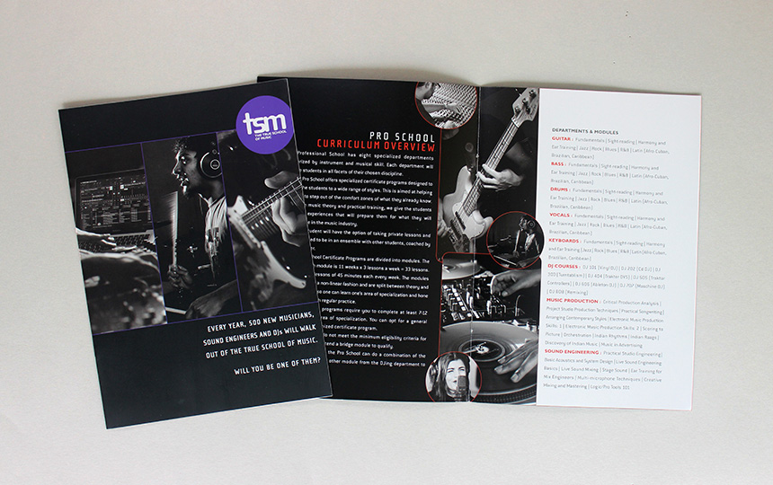
With disparate audiences and usages, the Identity required a system that was dynamic and modular in nature. Allowing the brand to speak in different voices across its varied stakeholder engagements.
“rgd has 2 incredible abilities. The first is their ability to understand a client’s needs and the second is the immaculate execution of that sensibility into design that really represents the brand and lasts forever. I have personally seen this happen for Bluefrog, my albums, my website and of course all their fantastic work at The True School of Music.”
– Ashu Phatak, Music Composer Co-Founder, The True School of Music (TSM) Co-Founder
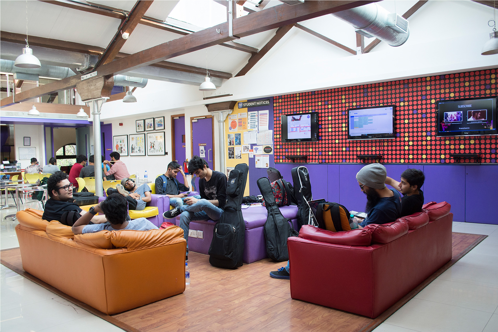
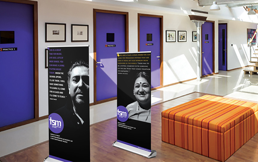
The decibel levels of the Identity and language was calibrated across touch-points. A narrative that worked optimally across spaces and geographies.
