blue frog
graphics, communication
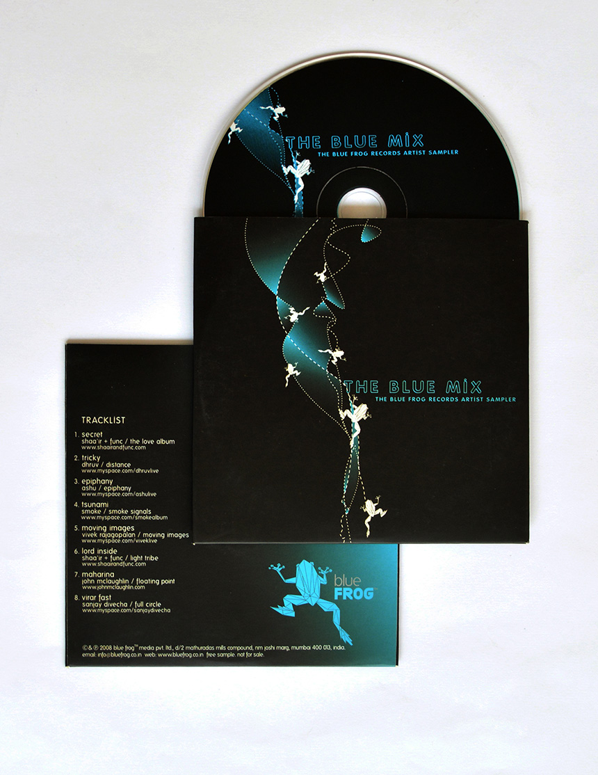
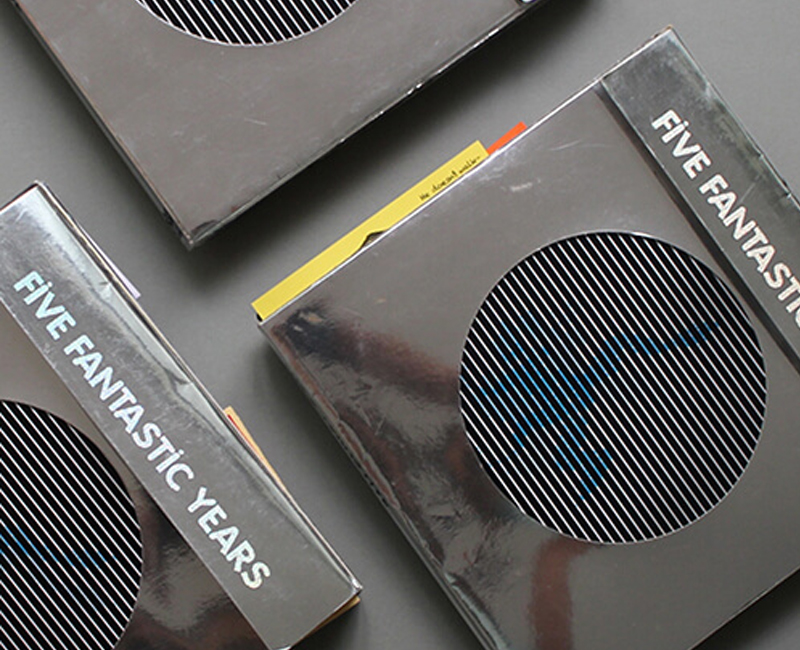
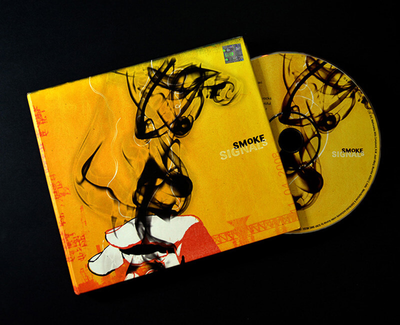
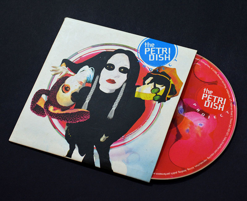
It was all about building a brand narrative around a name. Developing a standout visual language that would turn a logo into an iconic cultural emblem. Creating communication as eclectic as the music club itself.
blueFrog approached us with a club mark, and a brief to design marketing collaterals for the club.
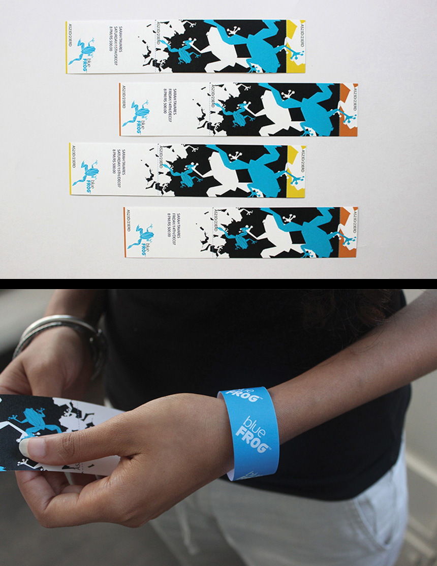
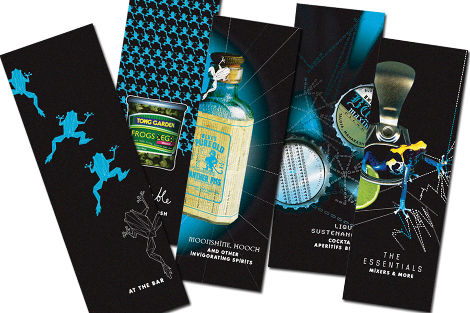
Our strategy was simple. We decided to build a unique narrative around the name and create a character that would live outside the constraints of a logo. Leveraging the frog, our design and communication was as out of the box as the Brand promise, transforming the Frog into a Mumbai icon.
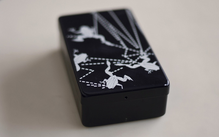
The frog walked and crawled its way onto any and every media or communication touch point available. Making heads turn every step of the way! Our cash boxes and matchboxes were such a hit that we kept reproducing them constantly. Frog merchandise became coveted possessions. Needless to say, the brand was considered a game changer - dividing India’s live music scene into two eras, before blueFrog and after blueFrog. The Frog was a runaway hit!
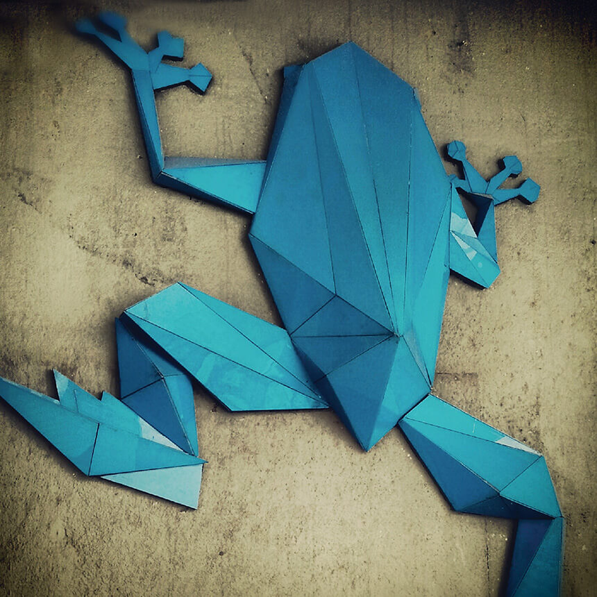
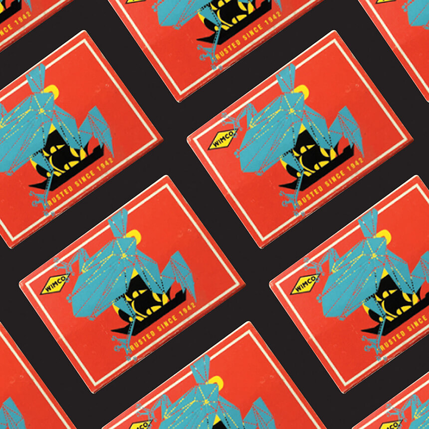
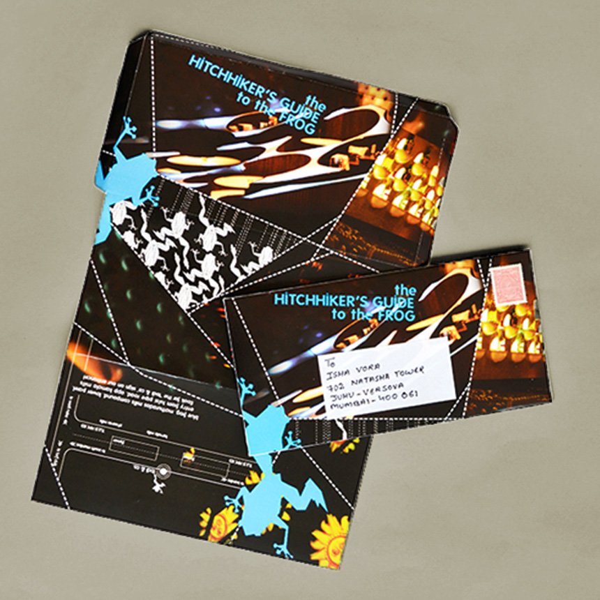
We saw the frog crawling across customer touchpoints, refusing to be confined, reaching destinations far and wide like the music the club espoused.
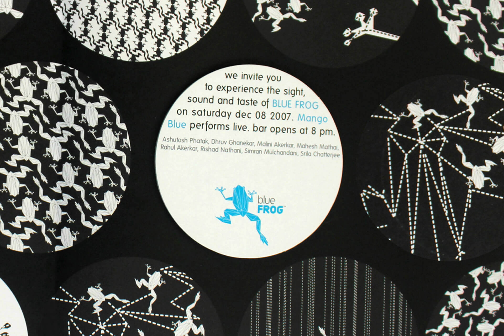
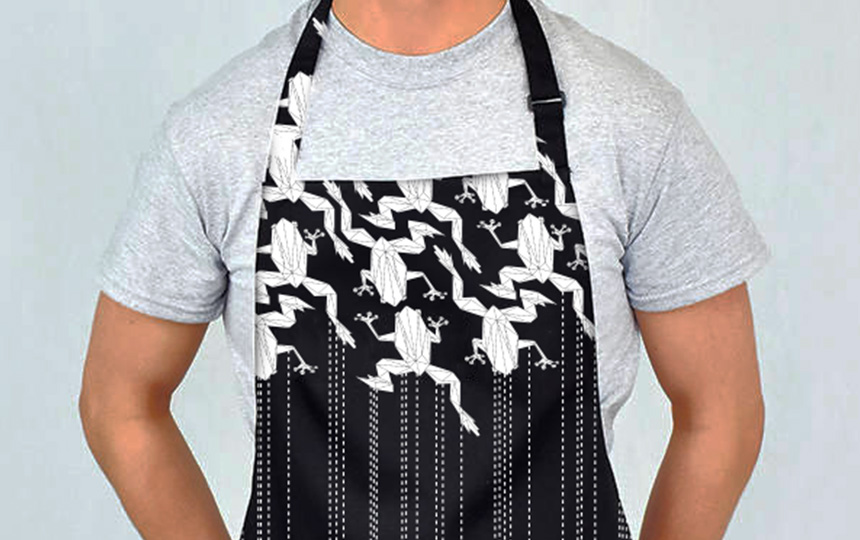
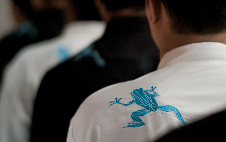
Surpassing our expectations, merchandise created by rgd soon became coveted possessions. Most popular were the pocket-sized match boxes and cashboxes, which became cherished ambassadors for the brand and were always in production.
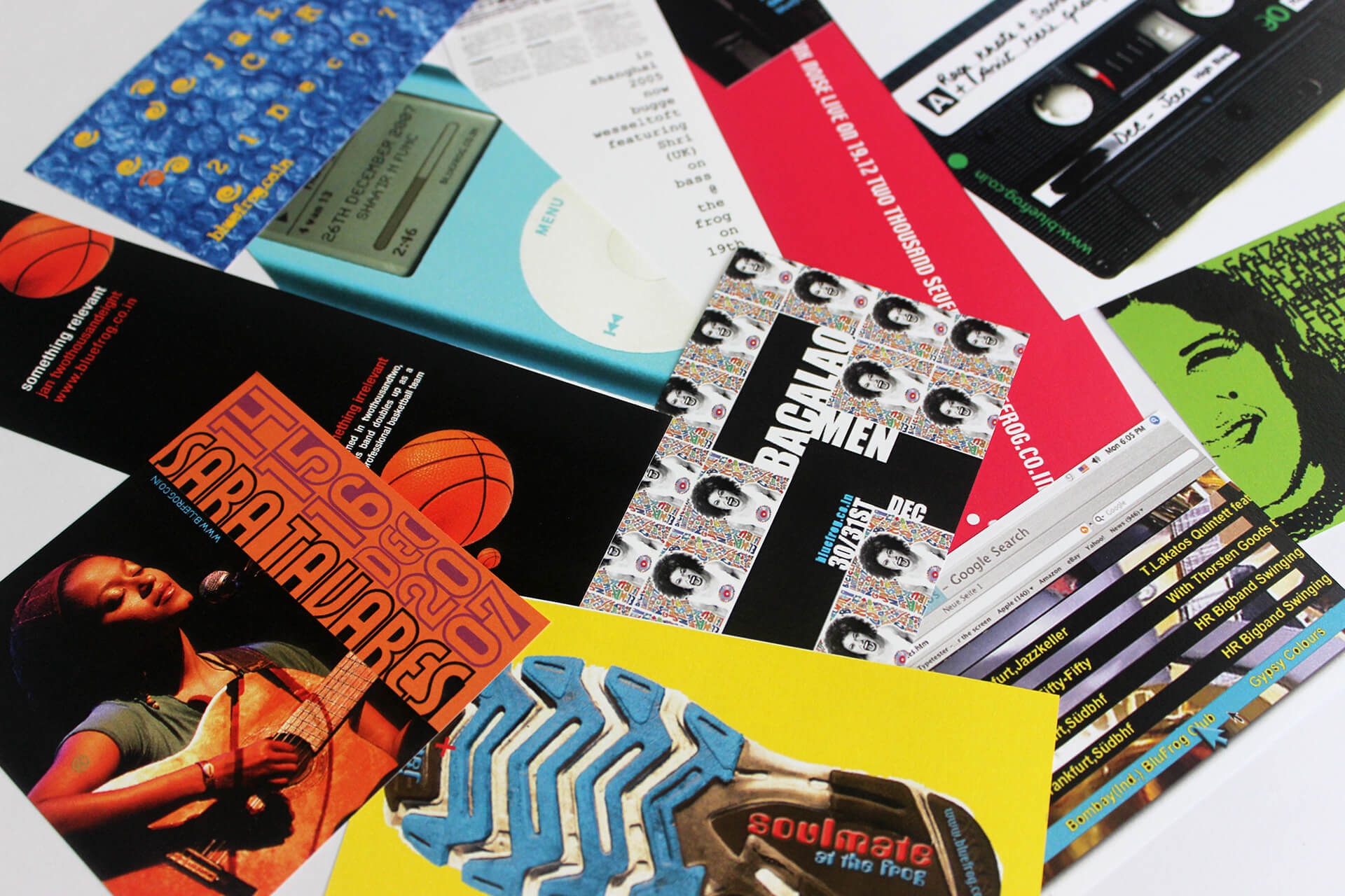

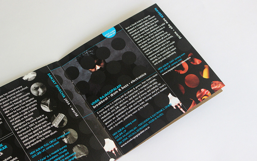
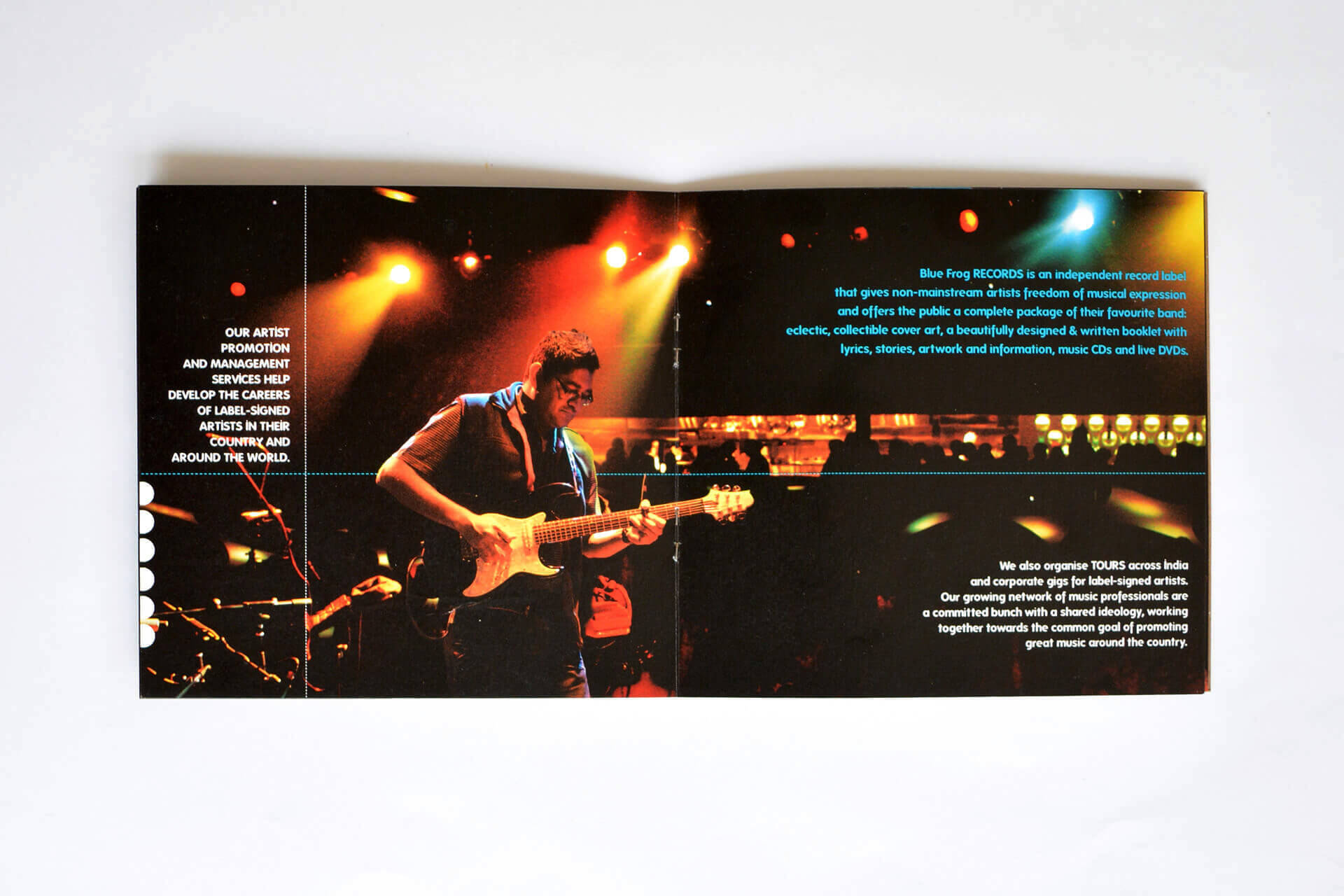
Eclectic, yet simple, the design delivery for all club collaterals pushed the brand imagery and continued to surprise the audience.
