magic bus
brand strategy, brand identity,
communication
Reframing the vision and, rebranding a non-profit, to help achieve their targeted goal of reaching a million children. Magic Bus was founded in 1999, with the sole intention of working with underprivileged children through a sports development curriculum. Taking them from a childhood full of challenges into a life of meaningful livelihood via sports based activity.
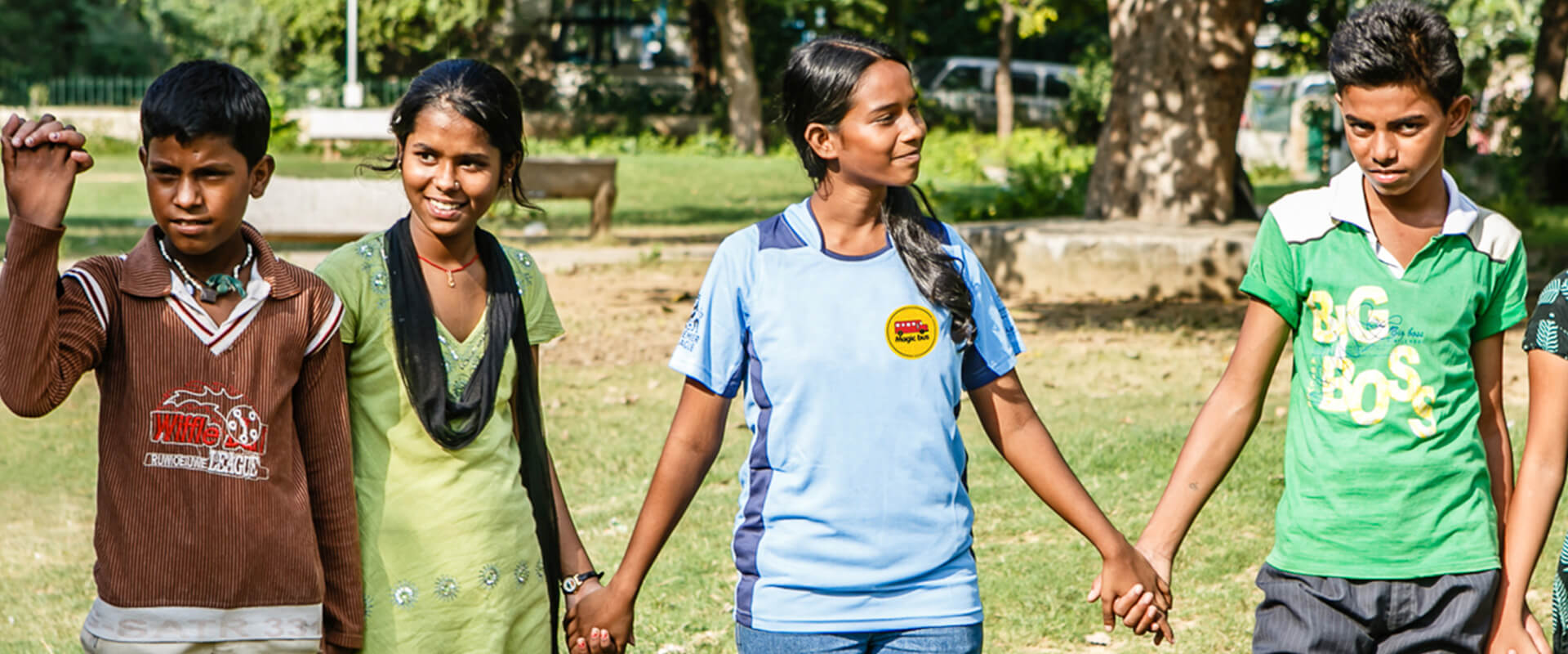
Magic Bus provides mentors and child support structures within communities, to create engagement programs that enable young people to leave poverty behind, and evolve into young adults with the right to choose and exert greater control over their lives. And enables mobilization of the entire eco-system available to children or youth, creating transformational change.
Magic Bus approached us to partner with them in articulating their vision, mission, positioning and help create a guiding philosophy and set of values. The initiative was to help re-align goals, streamline communication, and increase funding as they embarked on a drive to expand their outreach to a million children.
At the outset, we embarked on extensive research exercise across all key internal and external stakeholders, through 1-on-1 interviews, workshops and team sessions.
The imperative - any new thinking had to be an evolution of the company’s founding ideals, with involvement of the client at every stage.
Our design team created a central idea based on change and destiny; this became the basis for the vision, positioning and overarching message, which led to the evocative baseline: ‘Taking a million from childhood to livelihood’. Consequently, the client realised that the Brand Mark needed to be realigned to fit the new central idea, and to provide synergy of thought and solidity.
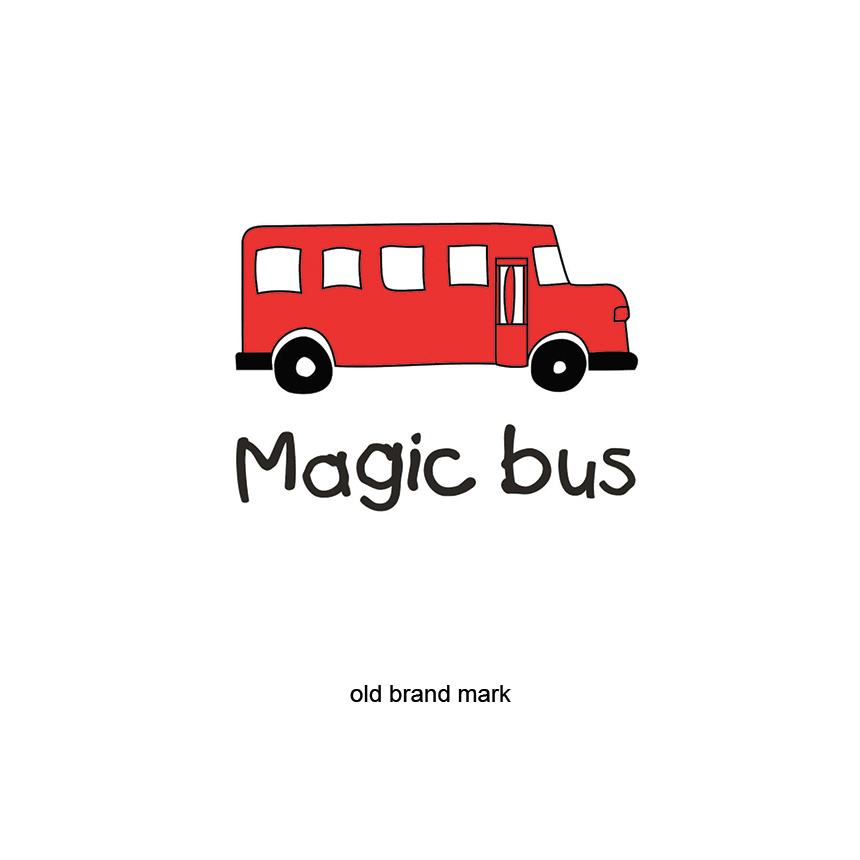
We retained the red bus brand asset because of its recognition and saliency. However research had suggested a lack of seriousness and formality. We reworked the type design to add formality. Two hand drawn encircling arcs were added to serve as metaphors for mentor and child on a journey together, and the unit was placed within a strong yellow circle to communicate a robust and secure eco-system. The baseline was positioned in close proximity to help communicate the company’s raison d’etre. The revised Brand Mark was accompanied by a well-defined visual language. Internal communication was designed to roll out the Brand Mark and introduce the freshly articulated vision and values.
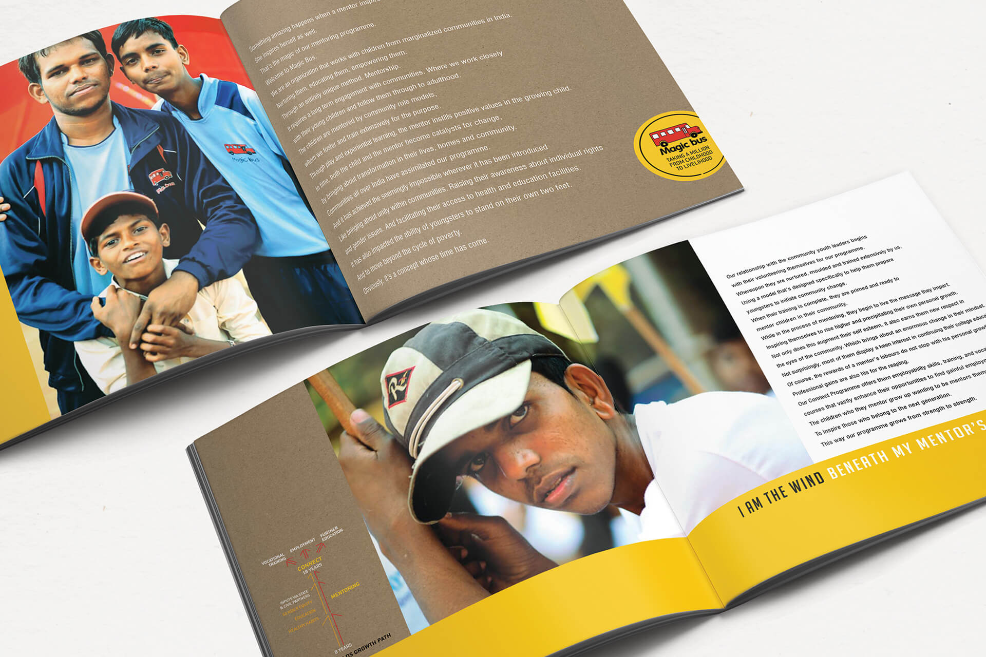
The new positioning and brand makeover was first escalated internally across all offices and centres. Brochures, event collaterals and a poster campaign was also designed for external audiences. The Programs have exceeded all expectations on funding and the number of children they support. Today, their programs in 22 Indian states cover 450,000 children. The Indian model is now being exported to Myanmar, Singapore. Nepal, Sri Lanka, Bangladesh and Indonesia.
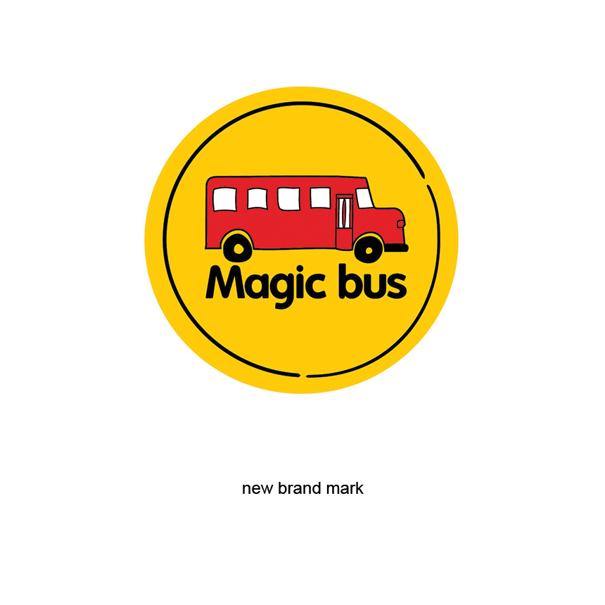
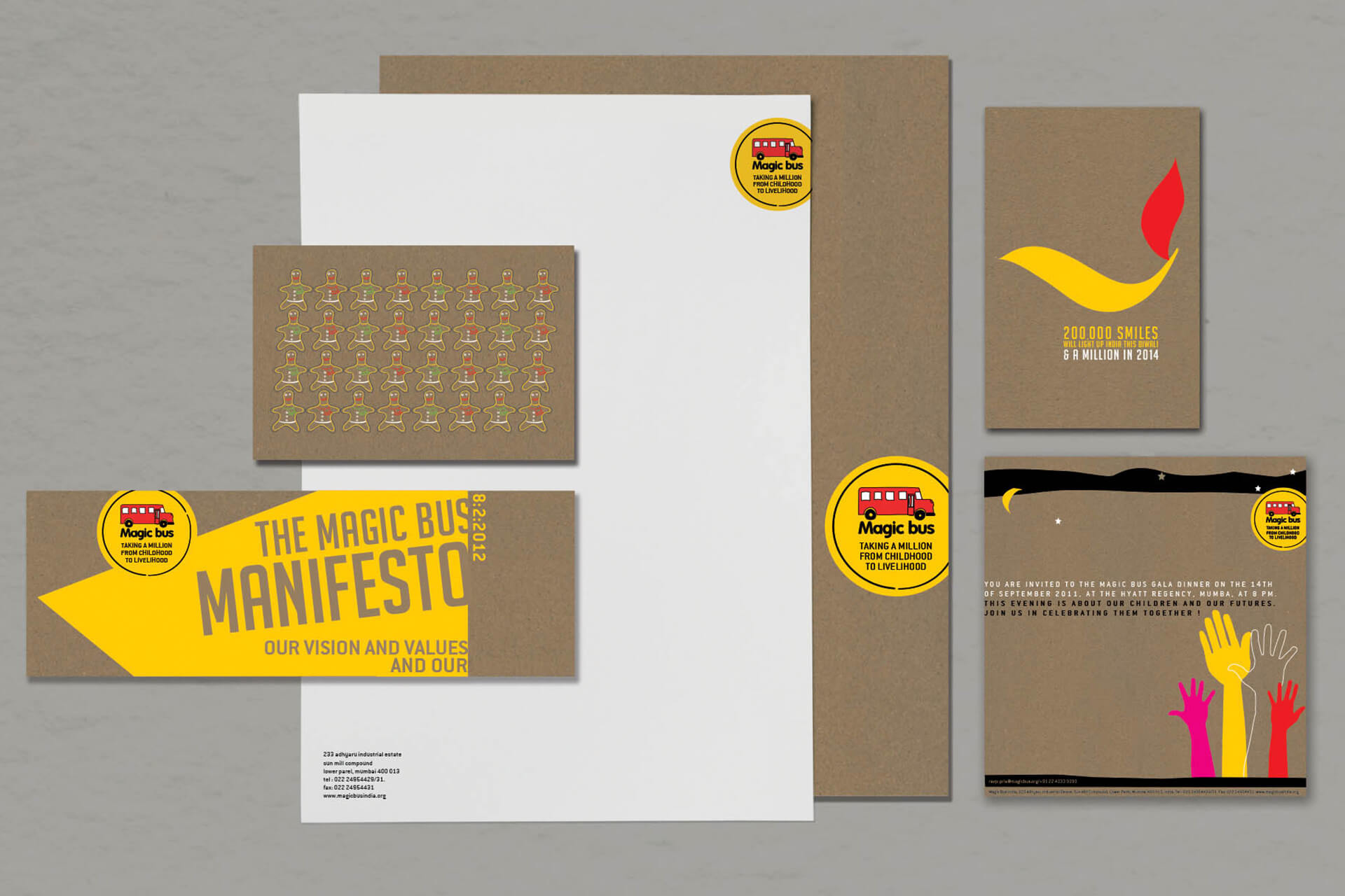
Our team created a central idea based on change and destiny; the basis for the vision, positioning and overarching message which led to the evocative baseline: ‘Taking a million from childhood to livelihood’. The revised more formal brand mark was rolled out with a well-defined visual language.
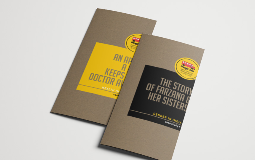
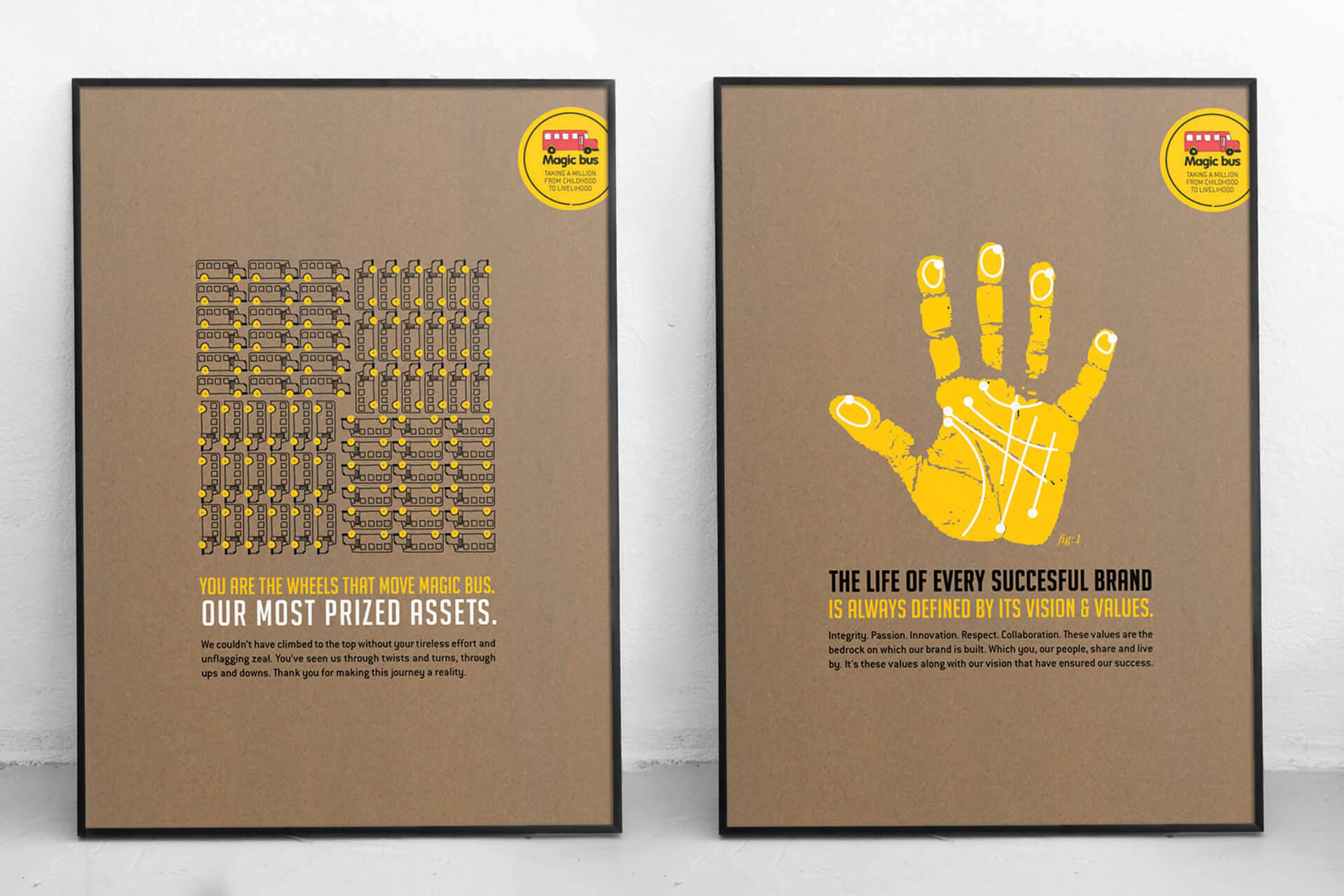
The new positioning and brand makeover was first escalated internally across all offices and centres. Internal communication was to introduce the freshly articulated vision and values. Brochures, event collaterals and a poster campaign was also designed for external audiences.
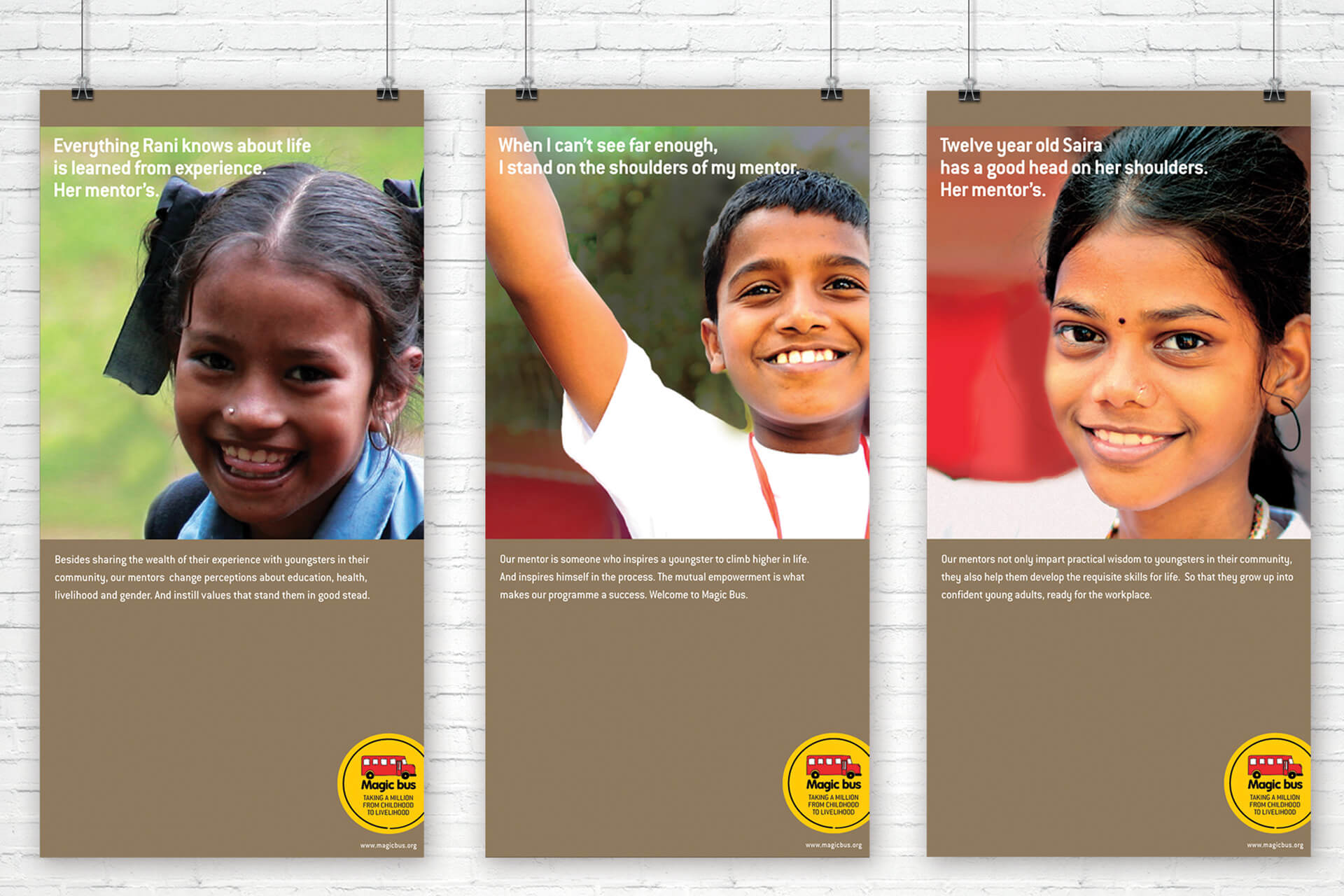
“I find rgd’s sensibility, commitment and really importantly their ability to broker and retain relationships really good. The commitment to get things right is fantastic. The inspiration/ perspiration balance is excellent. We went through a thorough process of interviews and workshops to understand what we should talk about and communicate. This led to
a relook at the logo, our website and our physical collateral based on rgd’s recommendations.”
– Matthew Spacie, Chairman, Magic Bus
