colonel saab
brand strategy, brand identity
Channelling modern Indian home life to design a Brand Identity and products for a contemporary Indian restaurant in London.
Colonel Saab is a trendy Indian restaurant in Central London, presenting contemporary Indian home style food, and a dining experience that reflects the famous Indian warmth and hospitality.
We were tasked to develop a brand identity system that would embrace and cohesively place the various elements that are part of the Colonel Saab experience.
The repertoire of food, the interiors and the interior design is a homage to the restaurateurs parents - Manbeer and Binny Choudhury and their personal story.
Manbeer affectionately called Colonel Saab, together with his wife are passionate about the finer things in life. An army couple, they are inveterate travellers and explorers; with an insatiable love for food and for entertaining. Famous for their art-filled home, well stocked table and generosity of spirit.
We positioned the restaurant to be a slice of their home, their lives. When you are at the restaurant you are in essence - “at home with Colonel Saab”. And you partake of their bar, their table and their hospitality.
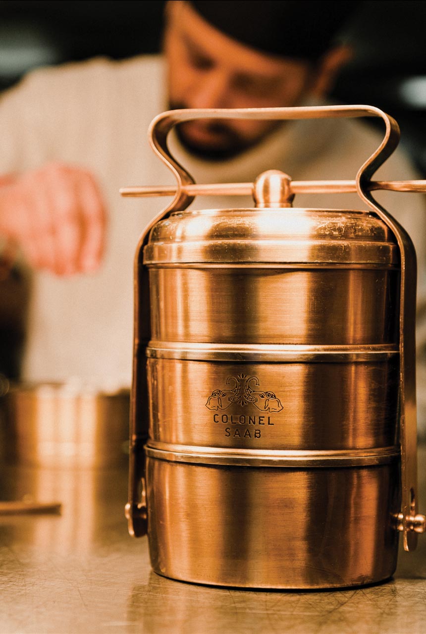
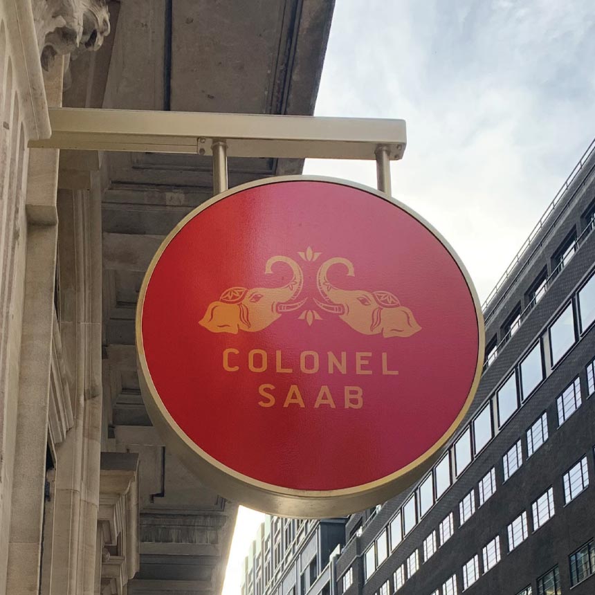
The brandmark draws inspiration from the family insignia, but is reimagined to present India modern. The colours, motifs and design typology used through the language is vibrant, contemporary but Indian.
The brand experience and the design language is eclectic, warm and fun.. each customer touch point carefully curated to reflect the mix and match ensembles entertaining at home in India today.
Using the rich backstory and a collection of personal memorabilia as inspiration, every piece of design has a narrative and personal significance to the space.
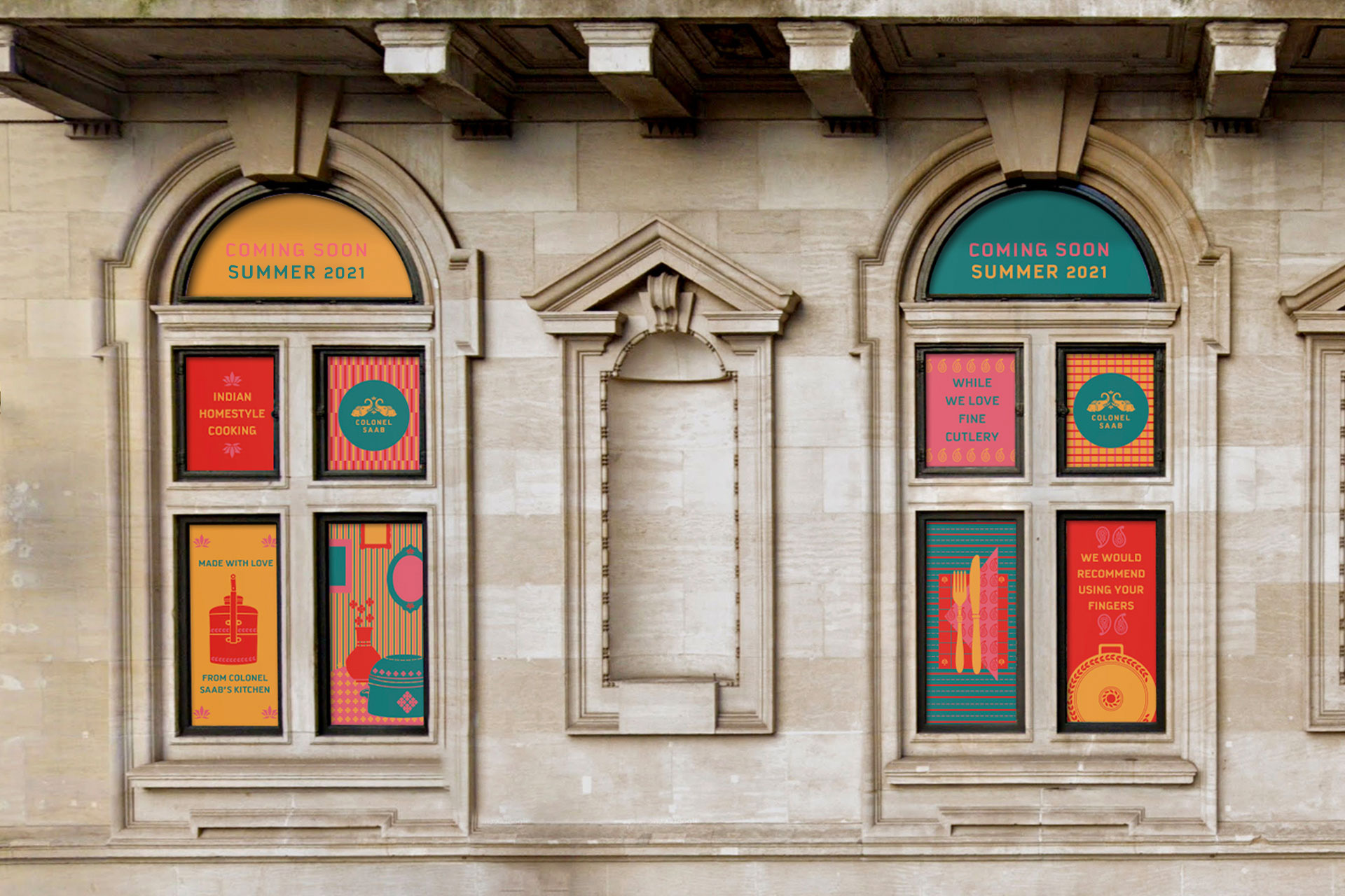
The brand mark draws inspiration from the family insignia, but is reimagined to present India modern. The colours, motifs and design typology used through the language are vibrant, warm and “home like”. Very much a reflection of the typical Indian home, where the food is the embodiment of love.
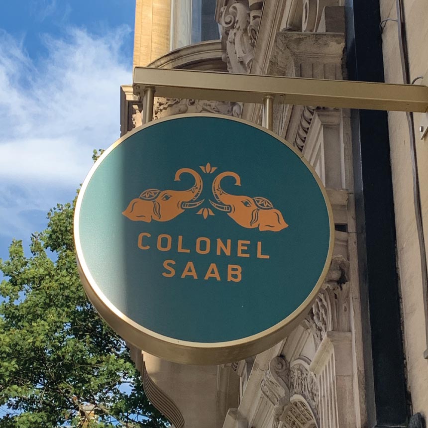
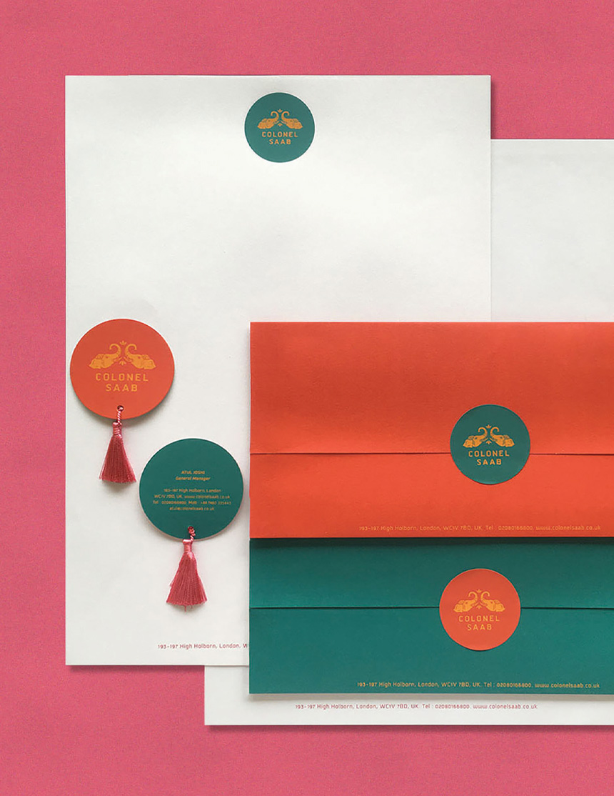
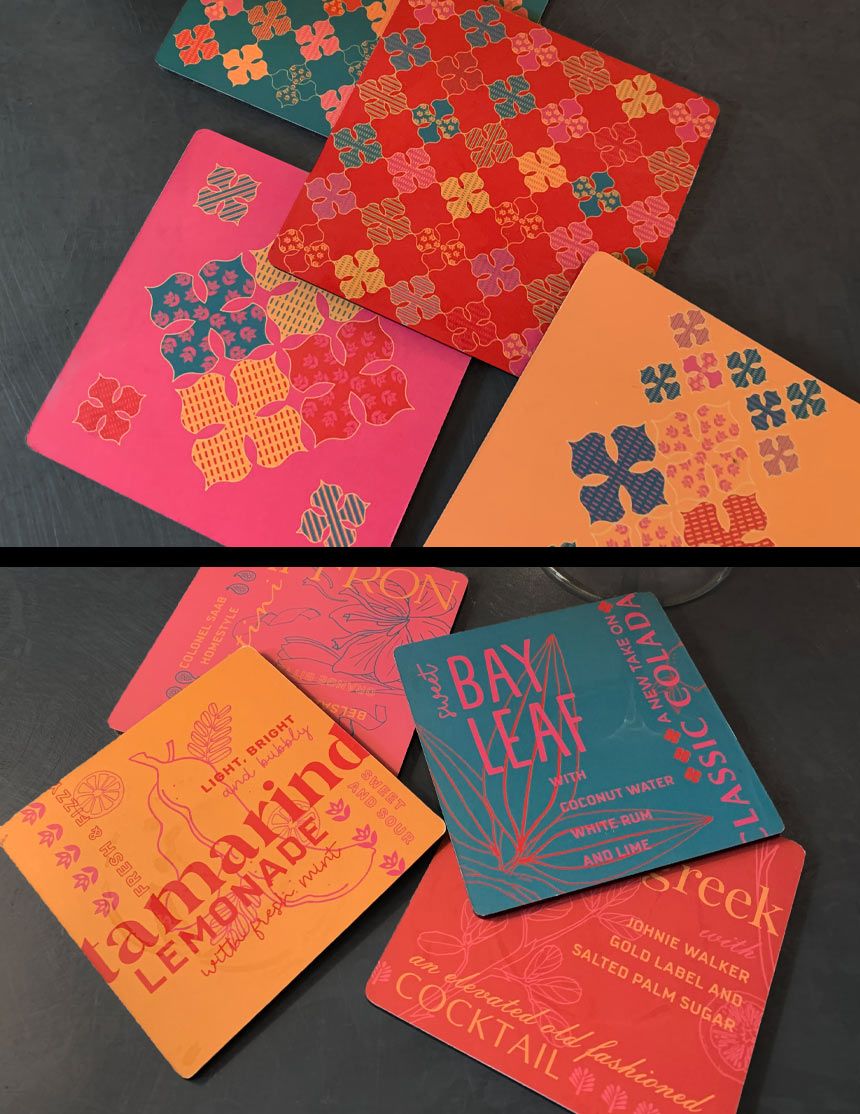
The restaurant collaterals carry forward the colours and textures seen in everyday India, with little details like a handmade “resham” tassel, or prints inspired by the textiles of the county.
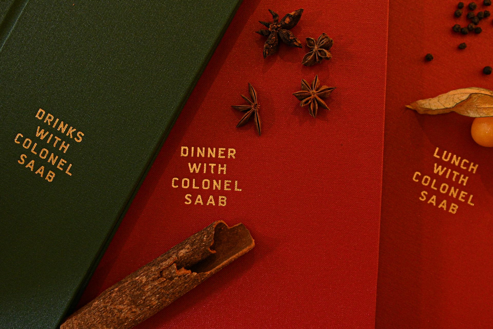
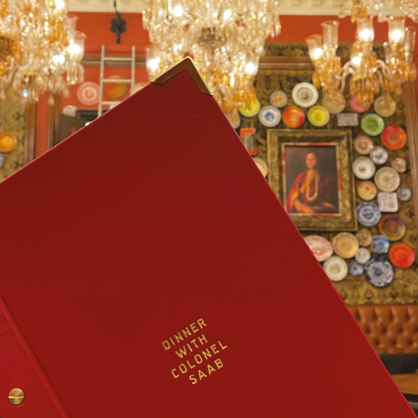
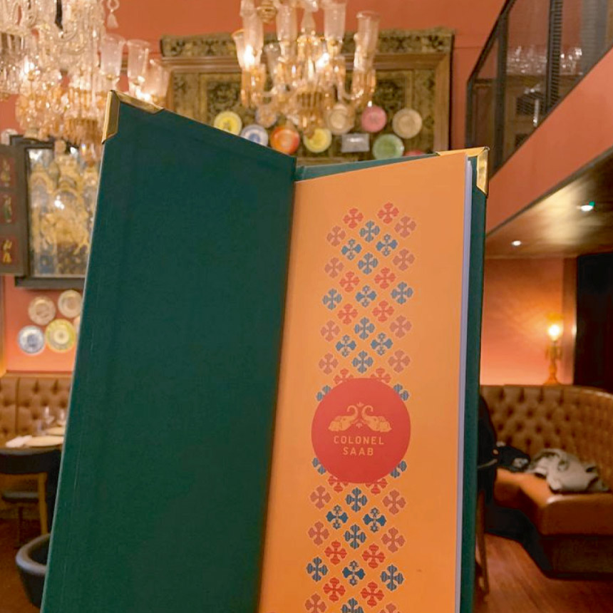
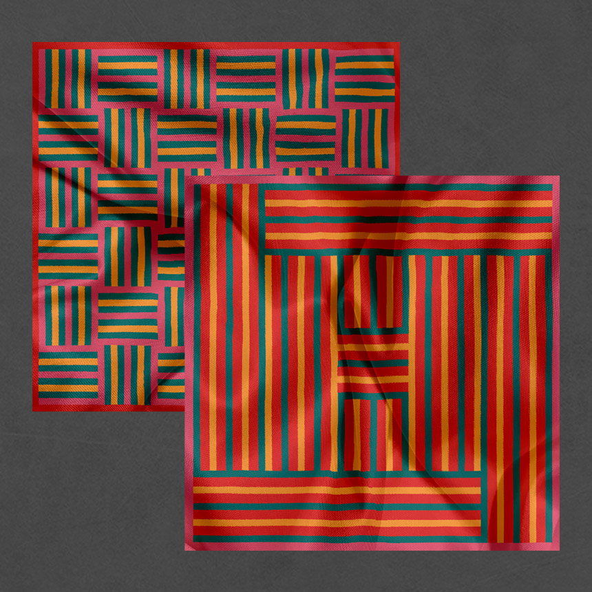
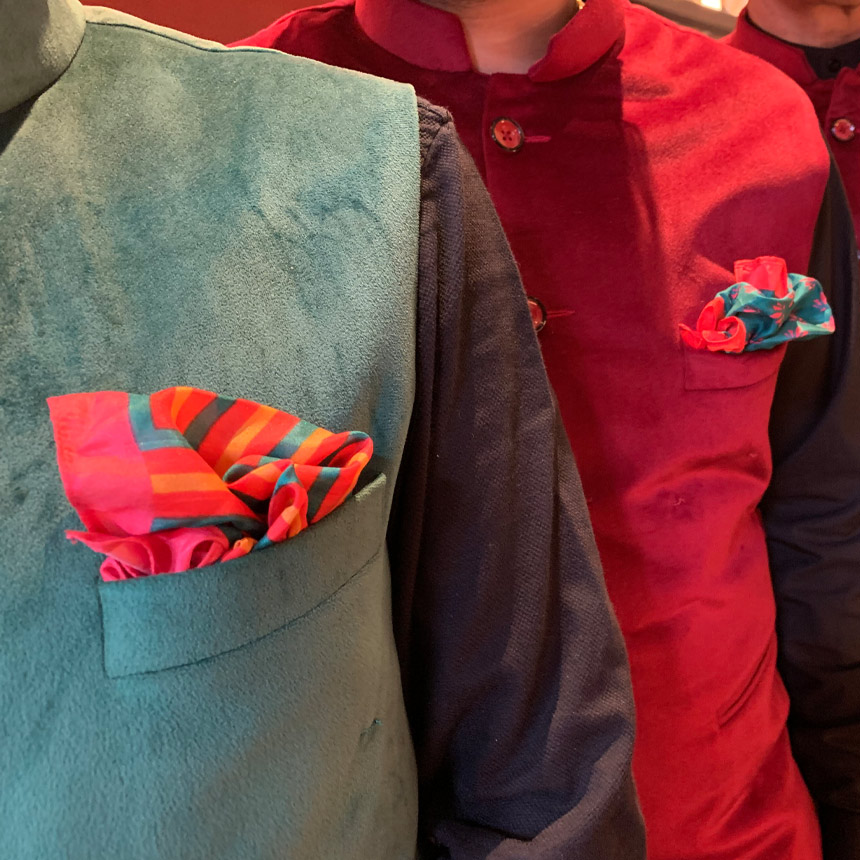
The vibrant language cuts through the curated maximalism within the interiors, with its bold colours and graphics extending onto the uniforms; making an unusual style statement.
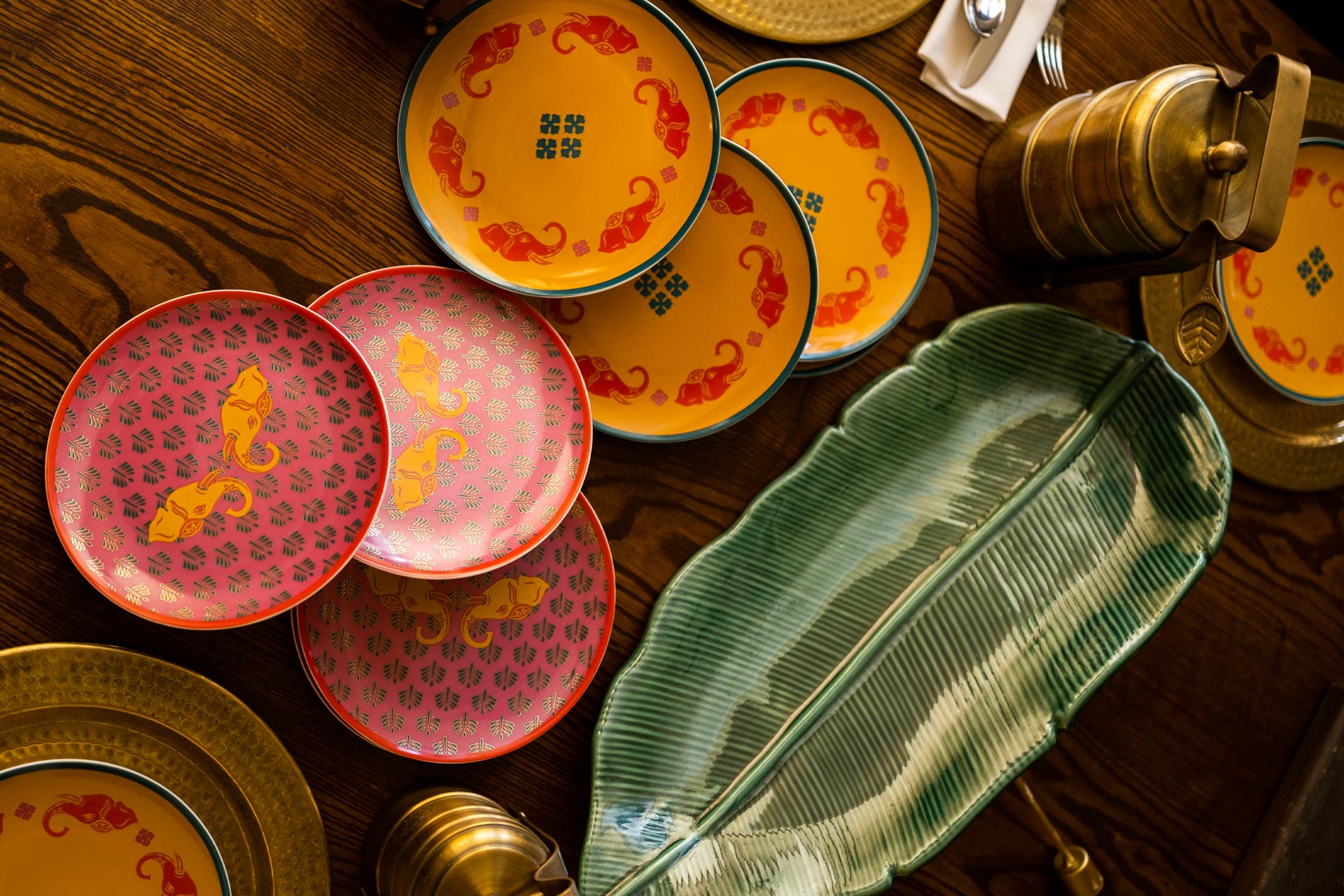
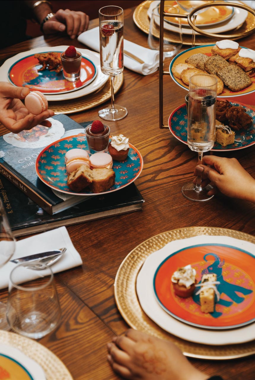
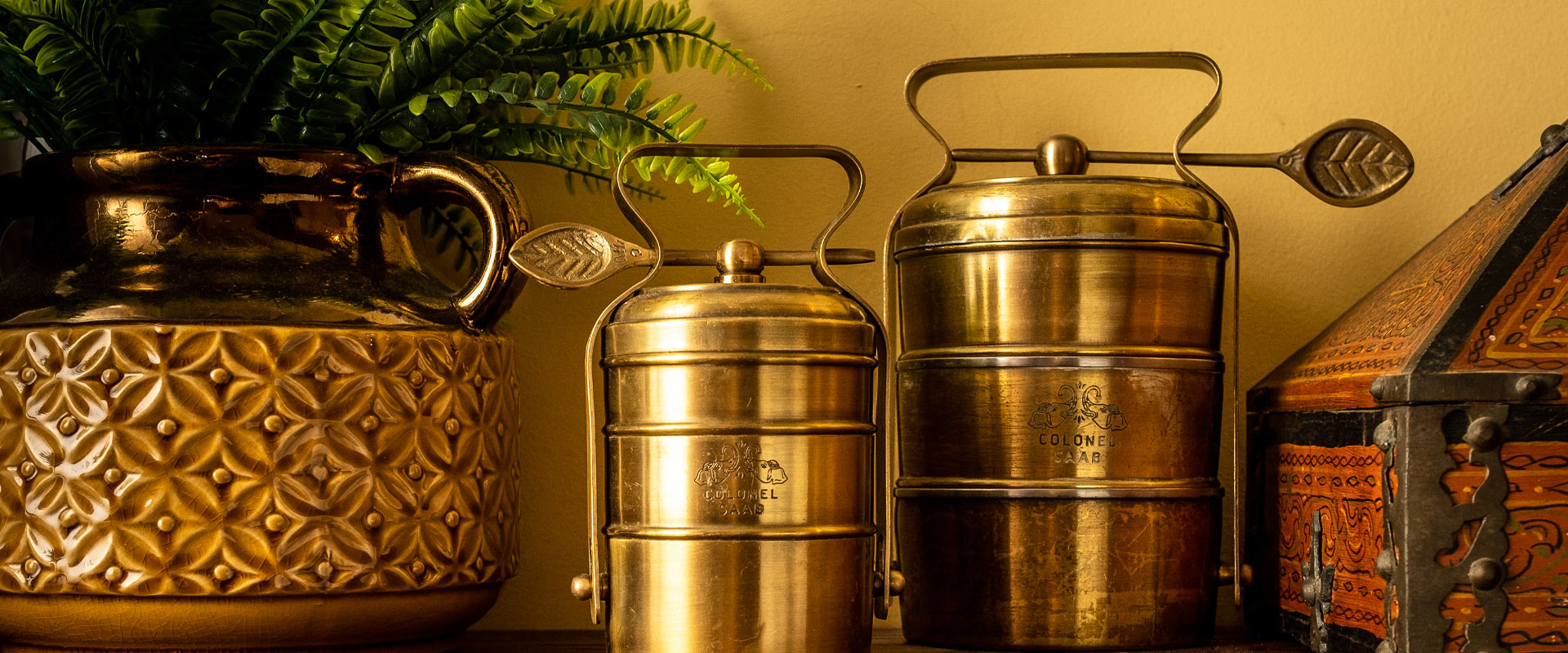
The team was also tasked to develop a range of products that would be used in the restaurant, and also sold as merchandise. Keeping in mind the mixing and matching of plates at home, we came up with a collection of fun designs that worked together or individually.
