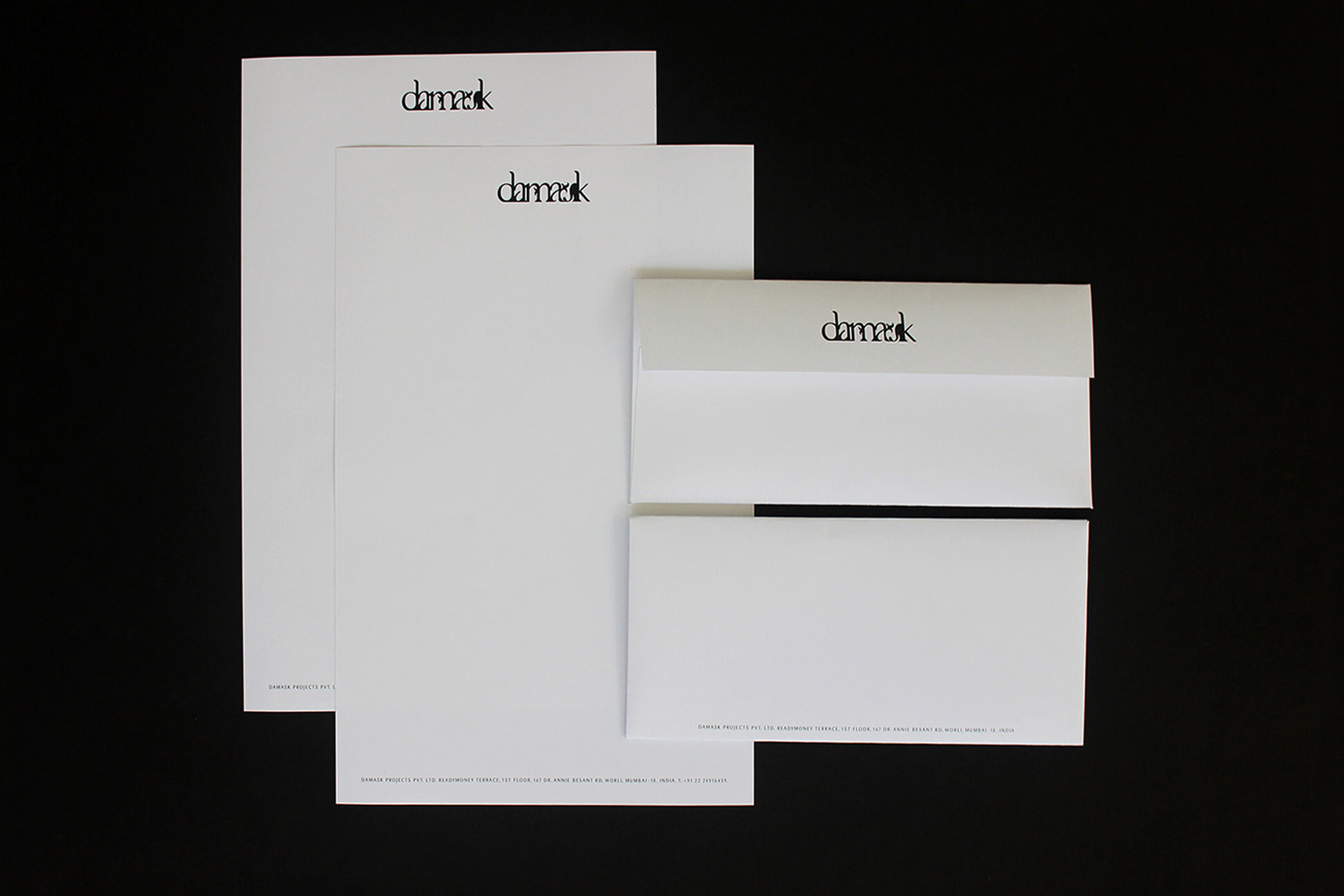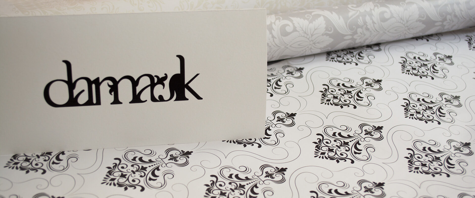
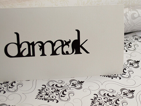
damask
brand identity
Handcrafted to to express the traditions of damask. We designed this wordmark to cross cultures and mindsets, whist capturing the creativity and professionalism of a woven textile business in a single glance.
The Brand Mark needed to communicate heritage and domain authority, whilst also portraying a contemporary attitude towards business.
Our bold hand crafted typographic solution was born out the history of Damask, and borrows from the principle of its craft – whilst acknowledging its Middle Eastern genesis through the motifs used.
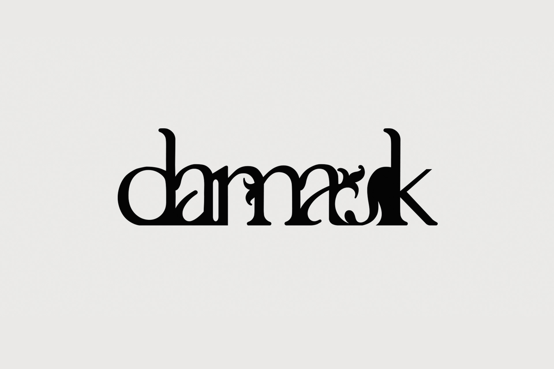
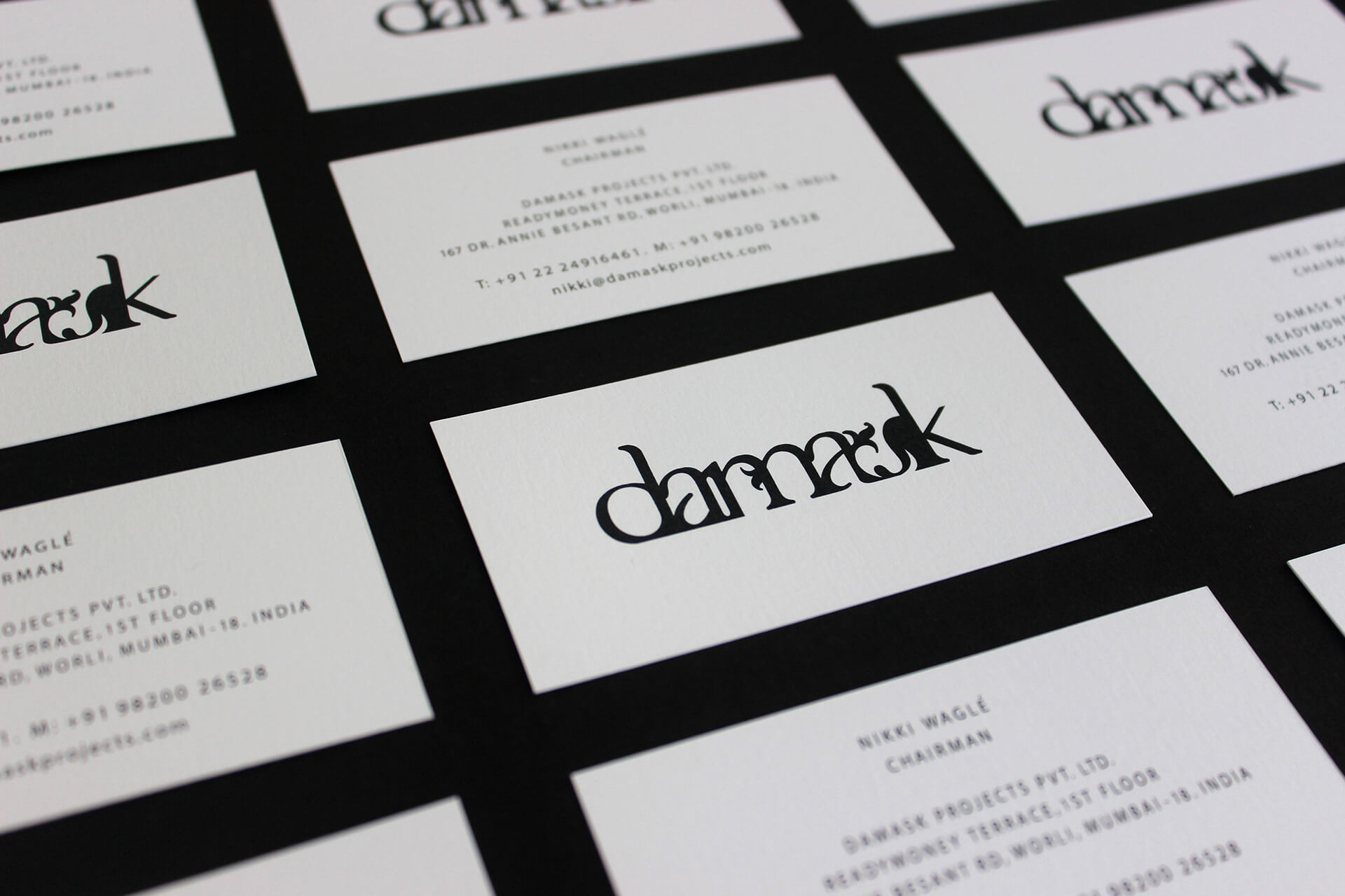
The fusing of a classic serif type, with a stark black and white palette was deliberate, as was the distinct, strong and edgy delivery. This identity is a shout out to hand drawn contemporary type design.