colorama
brand strategy, brand identity, packaging
Identity and packaging for student art materials, using customer behaviour insights and product benefits to create compelling pick me up products.
Hindustan Pencils, India’s largest stationery company, approached us to redesign their student art material range. We kicked off the process with focus groups conducted across schools and families, to better understand the market, the category and consumer buying behaviour.
Whilst the findings established the need for an independent brand for the art material range, it was our teams analysis of the data that led us to propose a bifurcation in the packaging graphics: one for pre-school and primary school children and another for teenagers.
Customer insights showed that Pre-school and primary school purchases were mostly parent or teacher choices, whilst teenage kids chose the product based on completely different considerations.
Two distinct graphic routes and messaging was recommended, each based on benefits and usage.
However we were very clear that the Colorama Identity should remain consistent across both segments – cuing category, leadership and quality; be bold and standout at point of sales via a significant colour and strong brand wall.
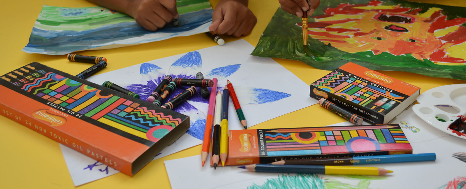
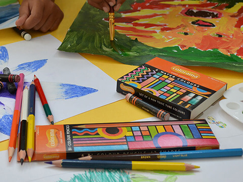
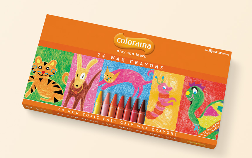
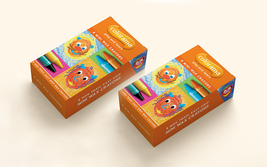
Drawing and colouring activities contribute greatly to the development of imagination, creativity, fine motor skills and cognitive abilities in young kids. We decided to appropriate this learning, developmental position, and created a line of packaging for pre-primary and primary schoolers – tagged play and learn.
Children in this age group have a natural affinity for the animal kingdom, and we drew our inspiration from the imaginative and fantastical drawings seen in the sketches and artworks of these children.
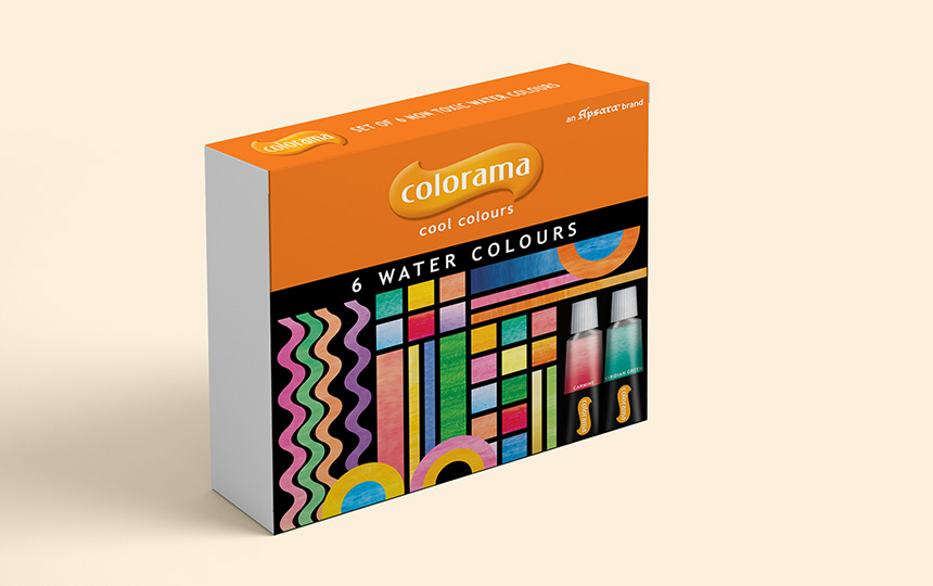
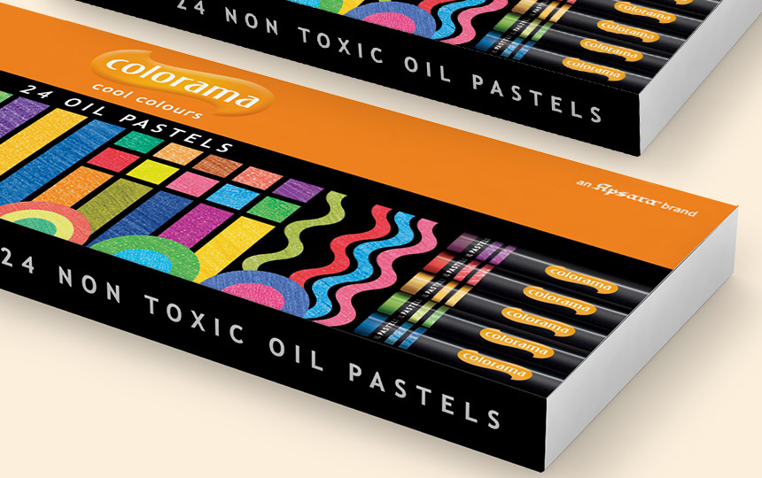
Our approach to the pack graphics and messaging for middle and senior school was quite different. The pre-teen or teenager has varied uses for art materials, and their responses to visual stimuli are as varied as their moods.
The challenge was to create a visual language that was pop and hip without losing its scholastic core. Inspired by the tactile and visual experience of art materials in usage, we created fun, abstract compositions – that were contemporary, bright and cool; alluding to the product experience through art, geometry or digital designscapes.
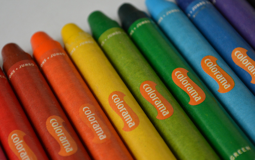
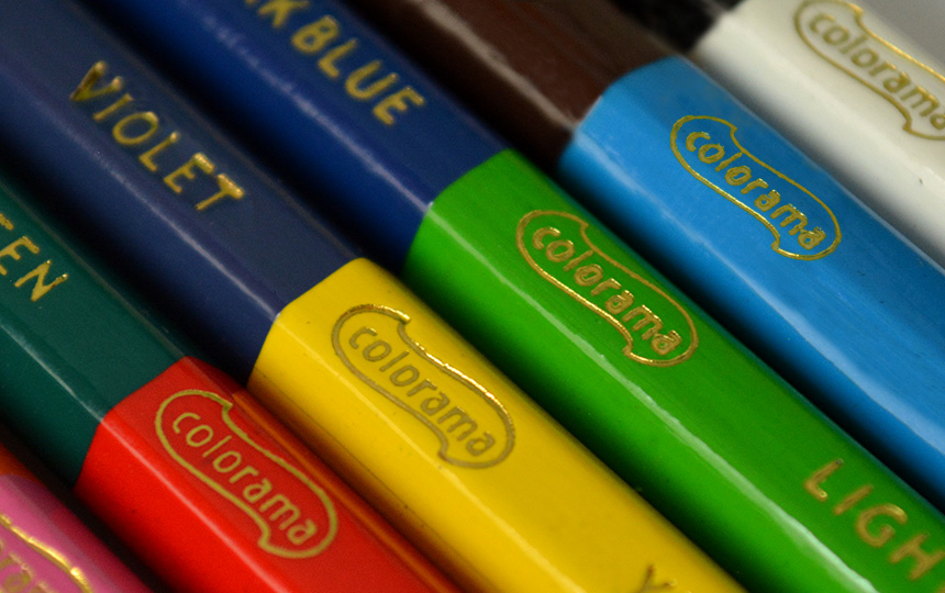
Whilst recommending two distinct ranges for two very different user groups, we were very clear that the Colorama Identity should remain consistent across both segments – cuing category, leadership and quality. Be bold and standout at point of sales via a significant colour and strong brand wall.
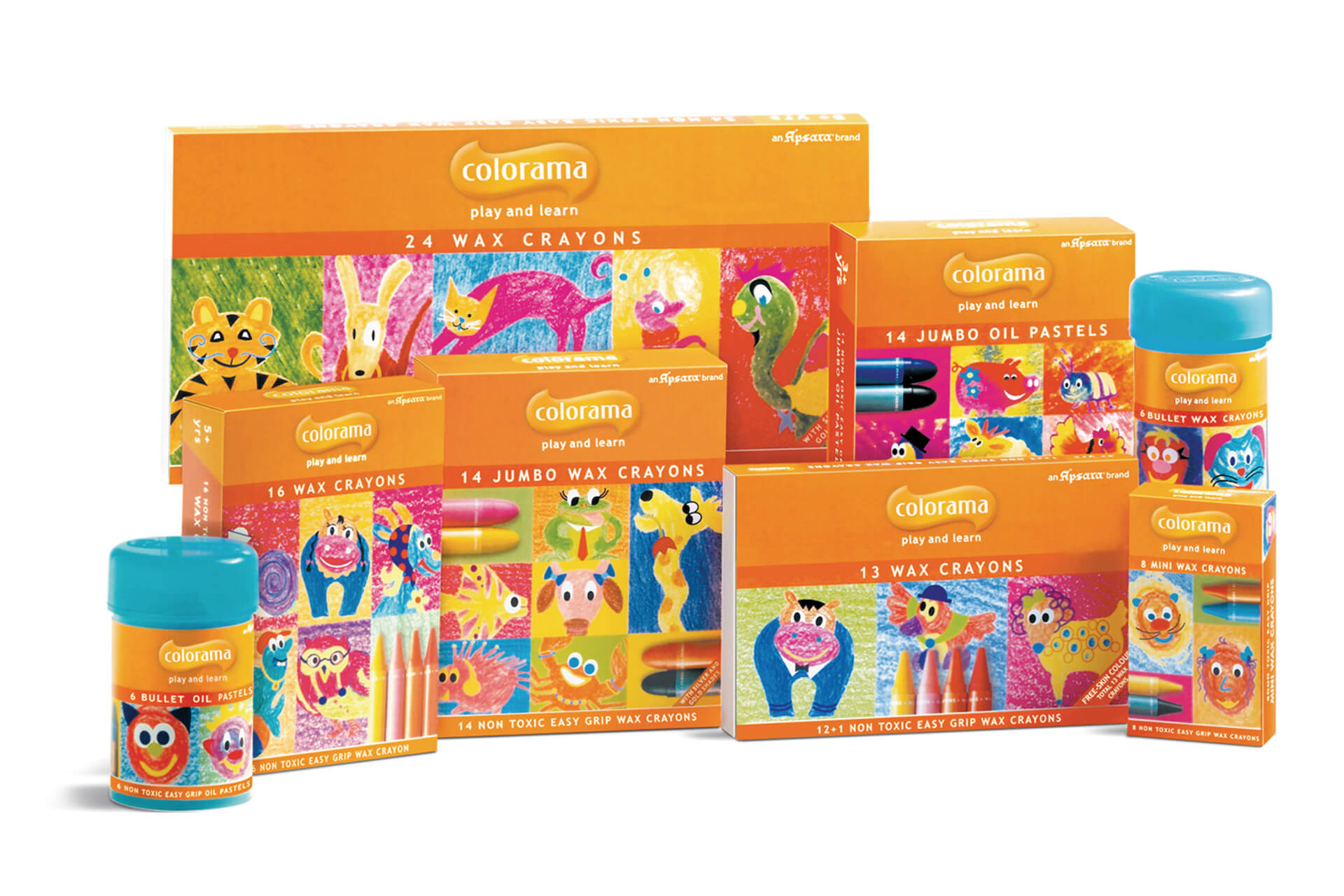
Drawing and colouring for young children is an essential part of their development – contributing to their imagination, creativity, fine motor skills and cognitive abilities. For our pre-school and primary school kids, we decided to appropriate this developmental position, and created a line of packaging tagged play and learn.
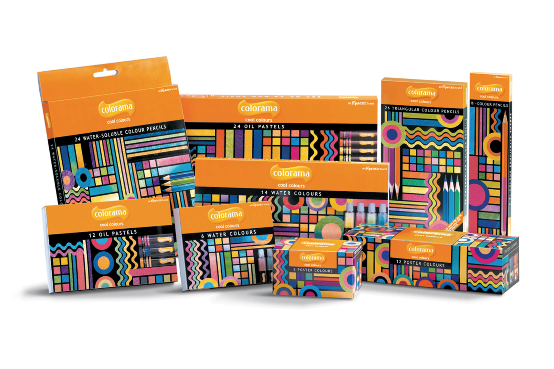
Middle and senior school kids have varied uses for Art materials, and their responses to visual stimuli are as varied as their moods. The challenge was to create a visual language that was pop and hip without losing its scholastic core.