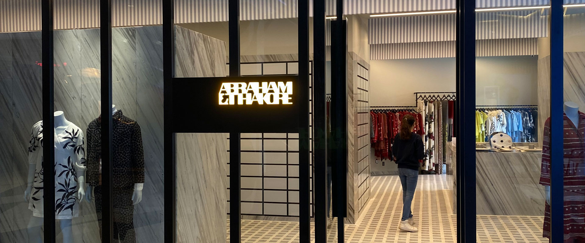
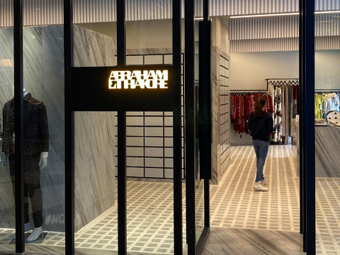
abraham & thakore
brand strategy, brand identity
For the new face of Abraham and Thakore we designed an identity that is informed by a design ethos 3 decades in the making. Breaking new ground in the world of luxury fashion signatures, the brand mark is as contextual as it is definitive; taking Abraham and Thakore boldly into the future, while continuing to acknowledge its rich past.
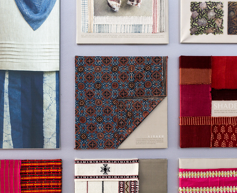
The Abraham and Thakore rebranding had to capture the brand's unique "fabric first" approach, moving it to a more contemporary space whilst carrying along its rich heritage and loyal customer base.
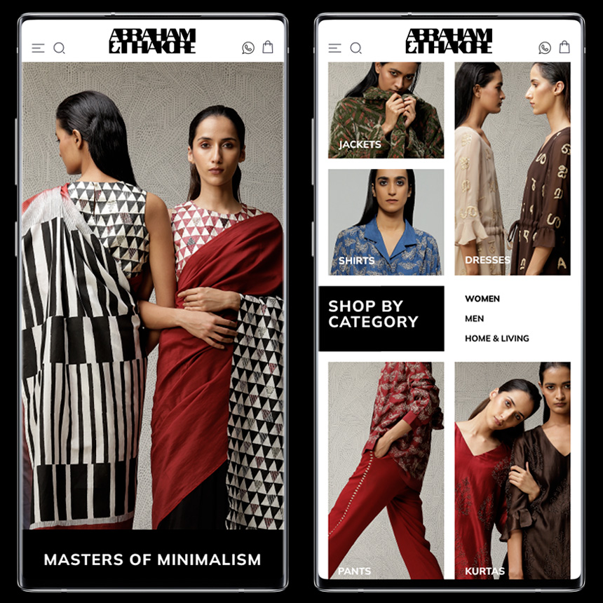
The branding needed to stand out on the high street, work on social media, and be relevant to a diverse audience - men and women across three generations.
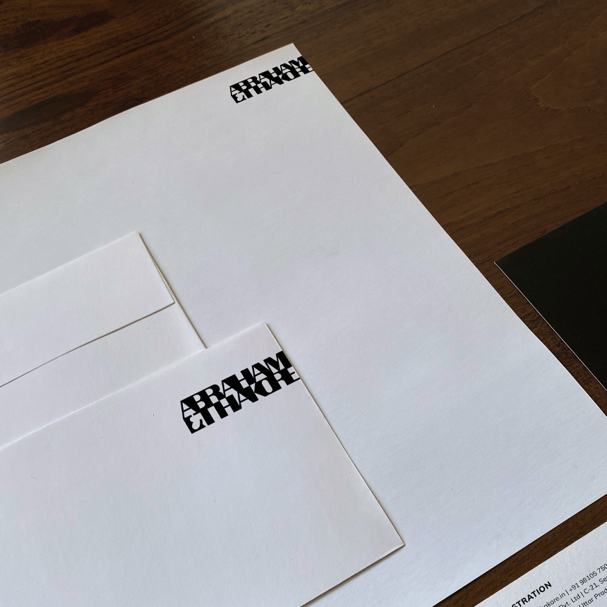
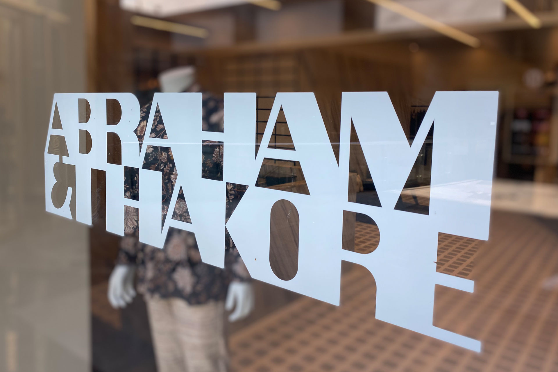
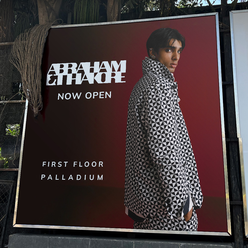
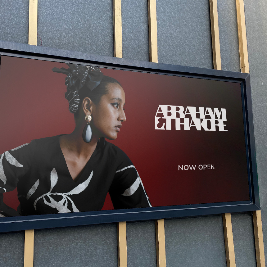
The brand mark and language emerged from the designer's unique typology that has held strong for 3 decades. Inspired by the geometries found within their iconic block prints and weaves, the mark references elements of fabric making that are trademark Abraham and Thakore. Handcrafted, with a hint of Devanagari, the typeforms play with positive and negative spaces creating, a distinct brand mark and a bold graphic imprint -negating the need for any further embellishments in the language.
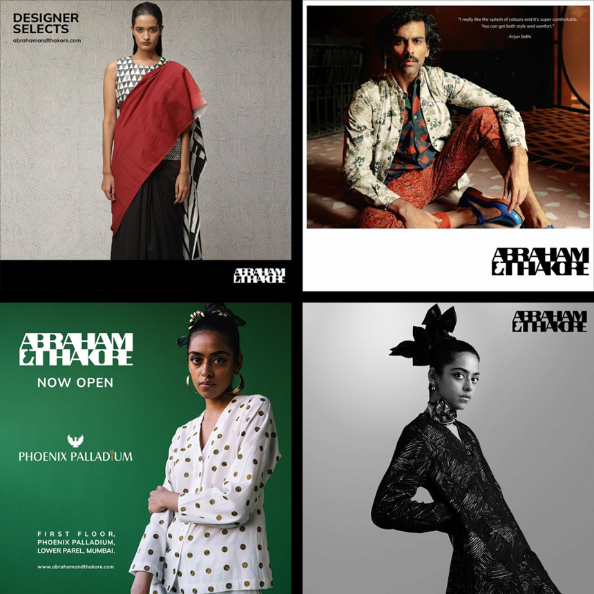
Launched to rave reviews at Fashion Week in October ‘22, the identity went live on socials simultaneously, getting over 1000 followers within two weeks, sans influencers! Setting standards in the world of luxe fashion - this chunky almost retro imagery has worked - "The new identity has revitalised the brand, spotlighting our core strengths and reconnecting to our heritage; our old customers identify closely with the refresh, and we are seeing a lot of younger customers.” The brand mark went on to win a baby blue at the Kyoorius awards 2023.
Inspired by the geometries found within their iconic block prints and weaves, the mark references elements of fabric making that are trademark Abraham and Thakore. Handcrafted, with a hint of Devanagari, the mark reflects both the diversity of cultural influences along with the universal sensibility of the ensembles.
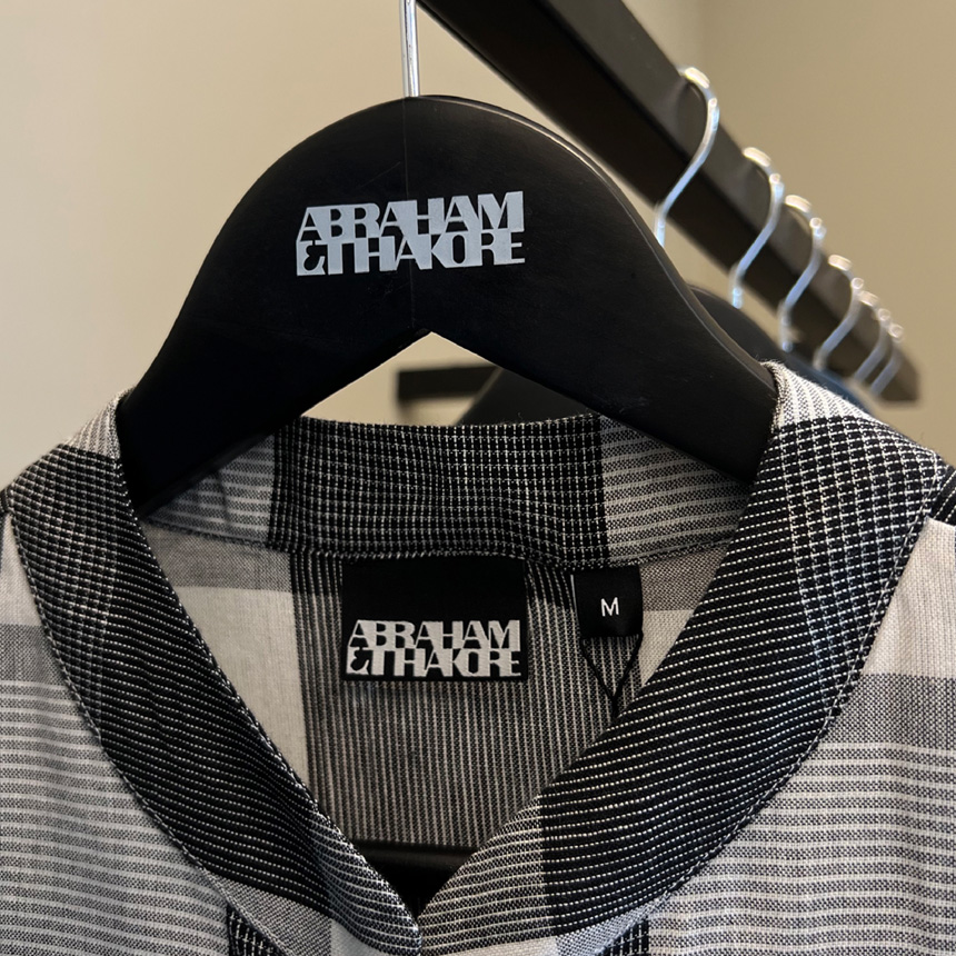
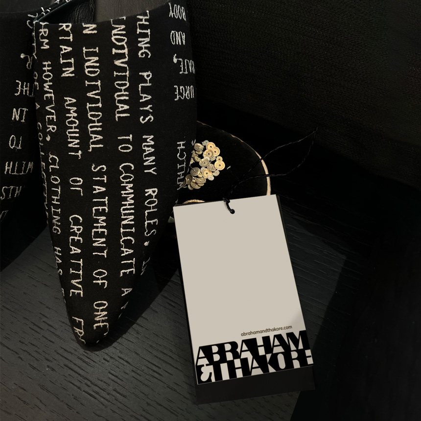
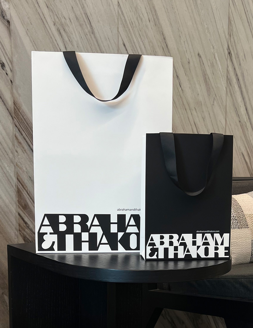
Completely hand-crafted, this imprint is designed to sit at the intersection of type and pattern. The unit with its strong presence needed no addition to complete the visual narrative and is used strategically across all customer touchpoints as a singular motif.
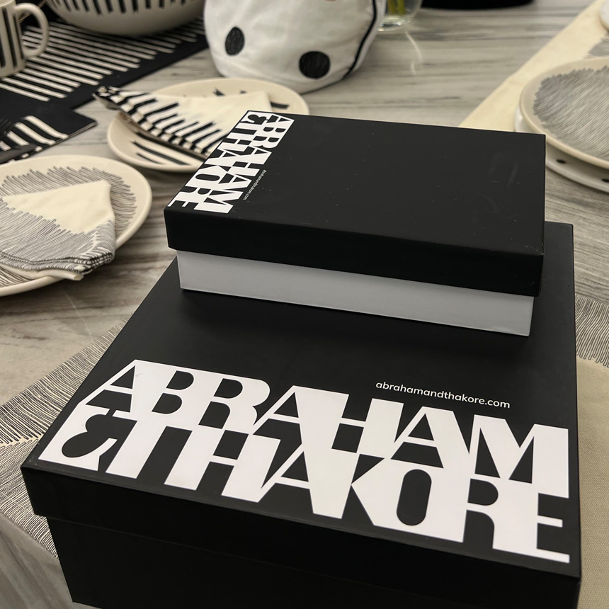
Playing with bold black and white, geometric spaces and counter spaces – is in the DNA of the brand. The design team continues this minimalist design ethos in their approach to the visual language in the A&T brand world.
Setting standards in the world of luxe fashion – this chunky, almost retro imagery breaks new ground– “The new identity has revitalised the brand, spotlighting our core strengths and reconnecting to our heritage; our old customers identify closely with the refresh, and we are seeing a lot of younger customers.” The brand mark went on to win a baby blue at the Kyoorius awards 2023.