15 NOVEMBER 2017
desing is thinking made visual
Lorem ipsum dolor sit amet, quaestio molestiae reforgmidans in mea, sea.
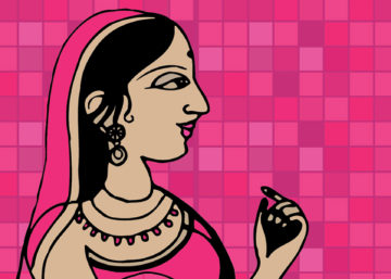
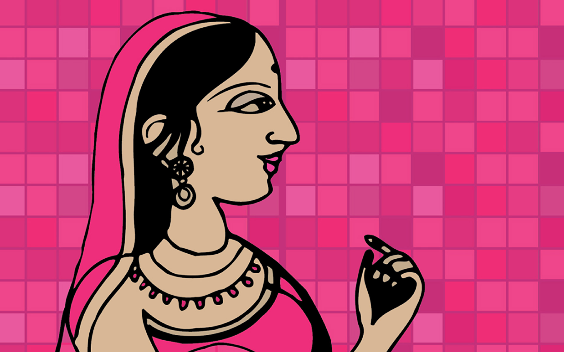
When Diana Vreeland said “that pink is the Navy Blue of India”, she was not referring to the icing pink of the local confectionary, or the pale pink adored by disney, hello kitty and little girls, rather she was refering to our very robust and regal, desi Rani Pink.
Whether Ms Vreelands comment was a reflection of the visible popularity of the colour, and thus her comparison to the ubiquitous navy blue of the west; or if it related to colour associations within cultures, we will never know… but as a designer I would say both.
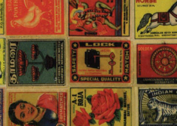
Rani Pink, unlike its western counterpart hot pink or fuschia, is a colour favoured by men and women in India, and has no real gender bias. Seen on Bollywood stars and starlets, at weddings and celebrations, on furniture and household products and very often even walls, this colour cuts a wide swathe nationwide. The exact shade of this colour is hard to pin down, but it sits between a full bodied pink and a red. The name allegedly owes its allegience to the queen in carrom, but more logically is a simple reflection of the usage of this colour amongst the Indian Royalty.
So why Rani Pink ? Well, before the onset of chemical dyes, shades of red and pink were developed from the root of Indian Madder. Legend has it, that some of these pinks closely resembled the deep rich pink of the gemstone, ruby, and hence became a popular colour for our Rajas and Ranis…and thereby the name.
So why did Rani Pink become such a favourite? Is it simply a colour that has been trending through the centuries, or is it something more…
Perhaps its got something to do with the physiological response to the shade,
Perhaps its got to do with cultural associations, or is it both and then some.